Developing Opportunities Into Vibrant Communities.
Daring by design
The Situation
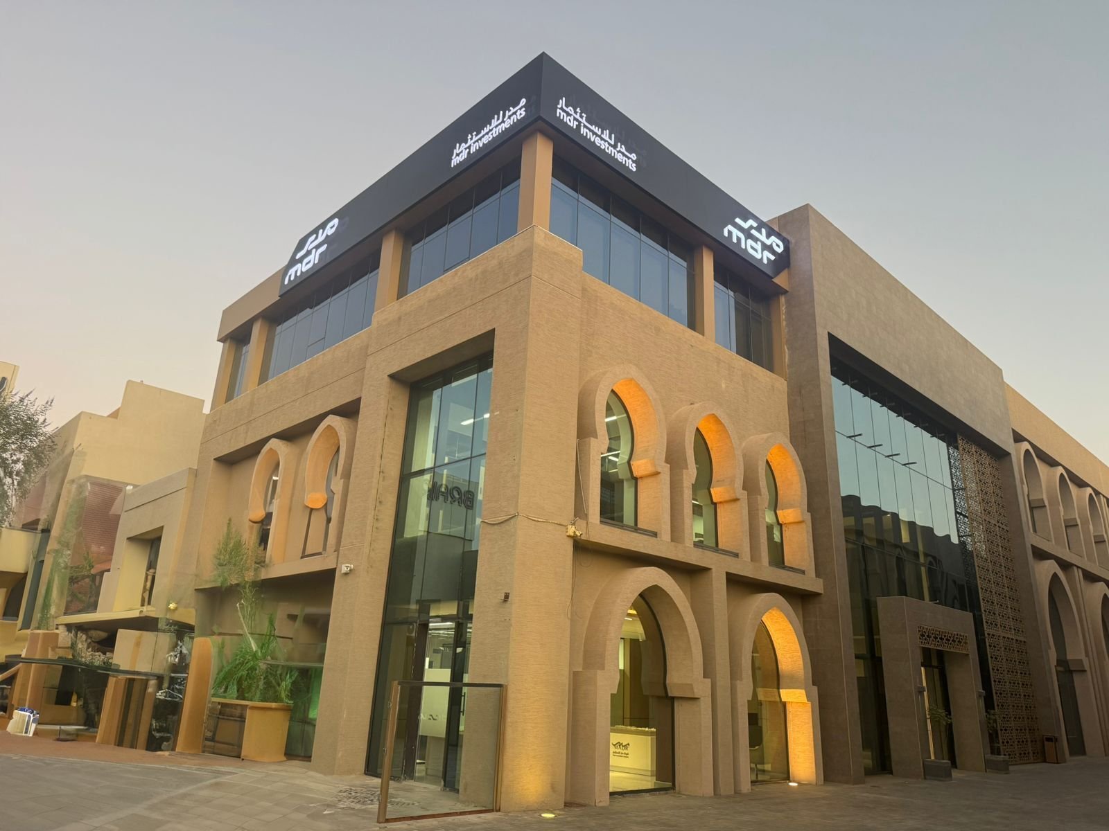
MDR was a long-established name in Saudi real estate investment — but its brand didn’t match its ambition. The company had four distinct business arms: investments, development, property and asset management, and realty sales and marketing. Each operated with its own identity, its own voice, its own visual language.
In a sector where trust is built on clarity, four separate faces read as four separate companies. The Kingdom’s 2030 vision demanded national partners, not fragmented operators. MDR needed to be seen as one developer with one purpose — building communities that belong to the future while honoring the culture they rise from.
The challenge wasn’t a logo. It was coherence.
Science
Brand Foundation
We started with a question, not an answer: what does it mean to develop a nation?
The answer became the brand’s operating doctrine. A brand essence built on exciting life — the belief that beauty is key and madness is genius, that it’s better to be absolutely daring than absolutely boring. Five values — Creativity, Teamwork, Integrity, Passion, Excellence. And a brand persona: the Visionary — a leader, an architect, an environment enthusiast, a patriotic, caring Saudi man in his late 30s who is fun to work with.
His mission: “Develop” the country. Leading the real estate sector by turning opportunities into vibrant communities in harmony with their surroundings — diversifying investments, applying governance, enhancing financial performance.
One foundation. Four business arms. One voice. Never off-key.
Senses
Design & Development
Then we built what the market would feel.
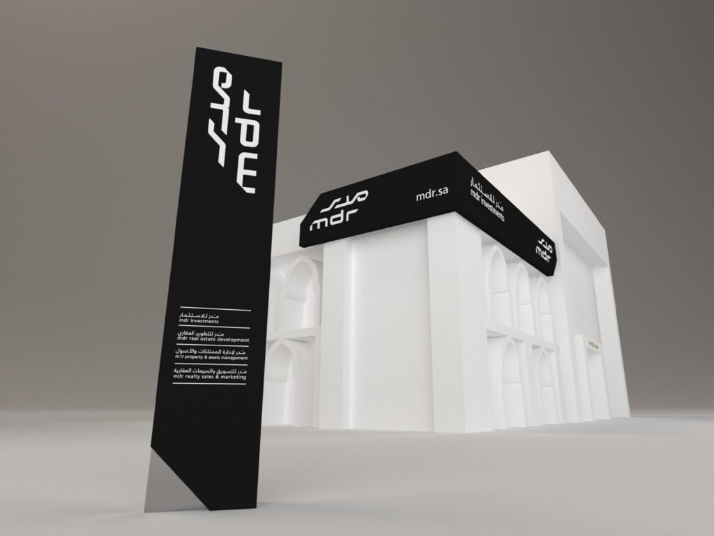
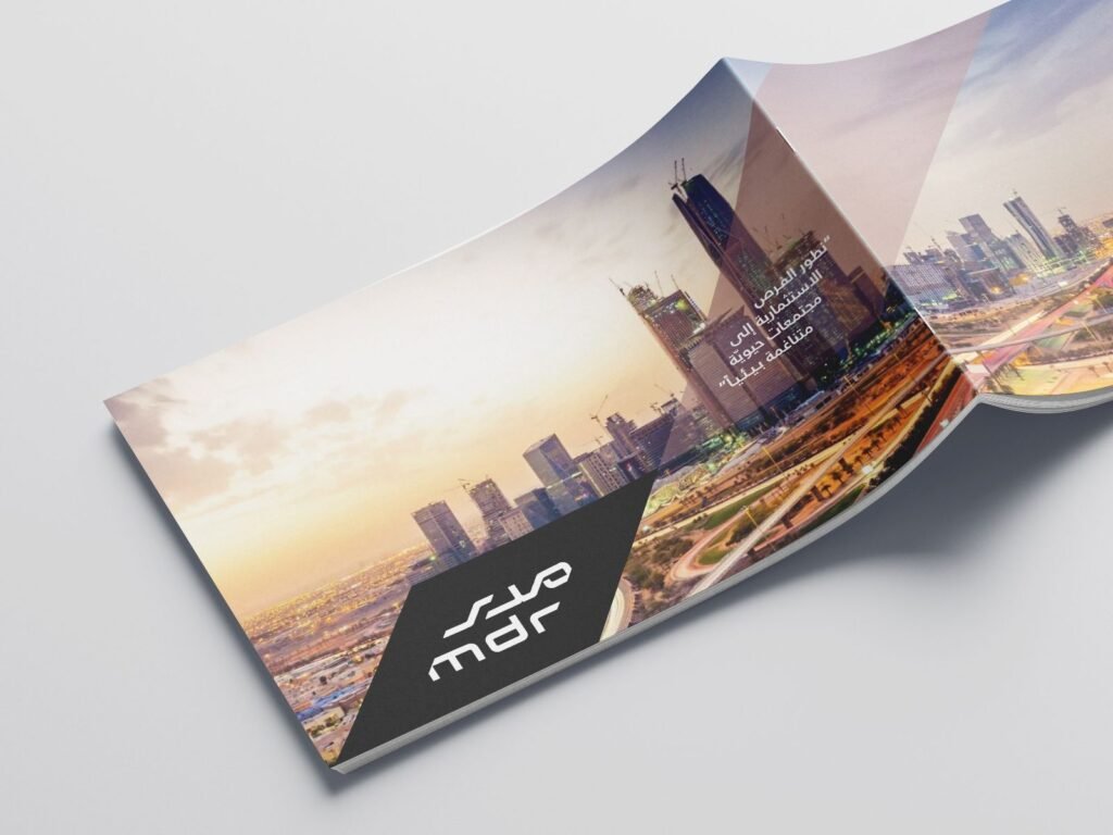
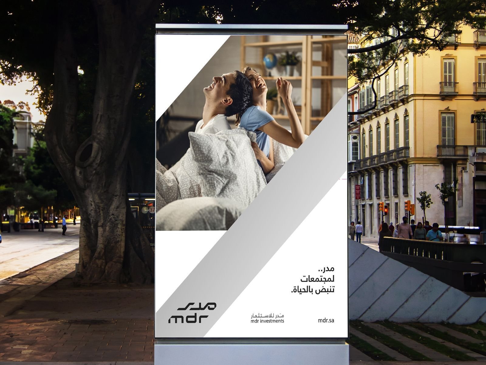
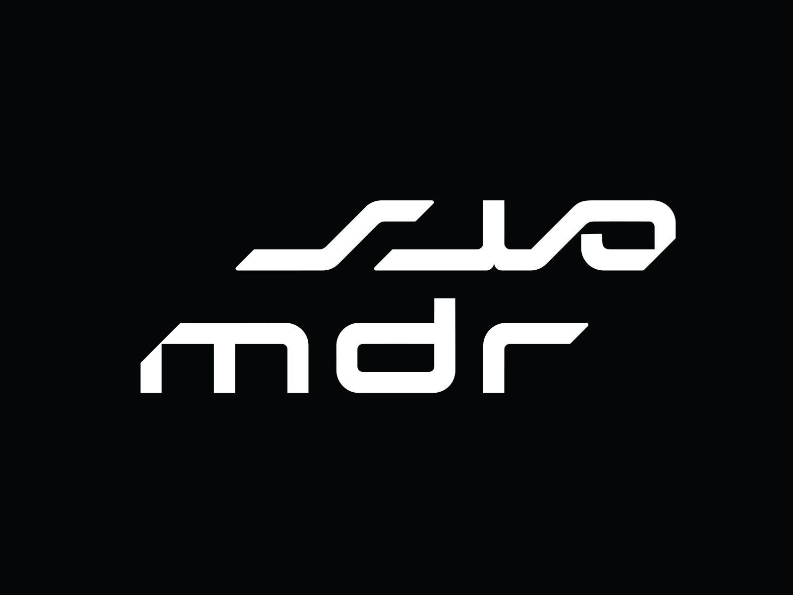
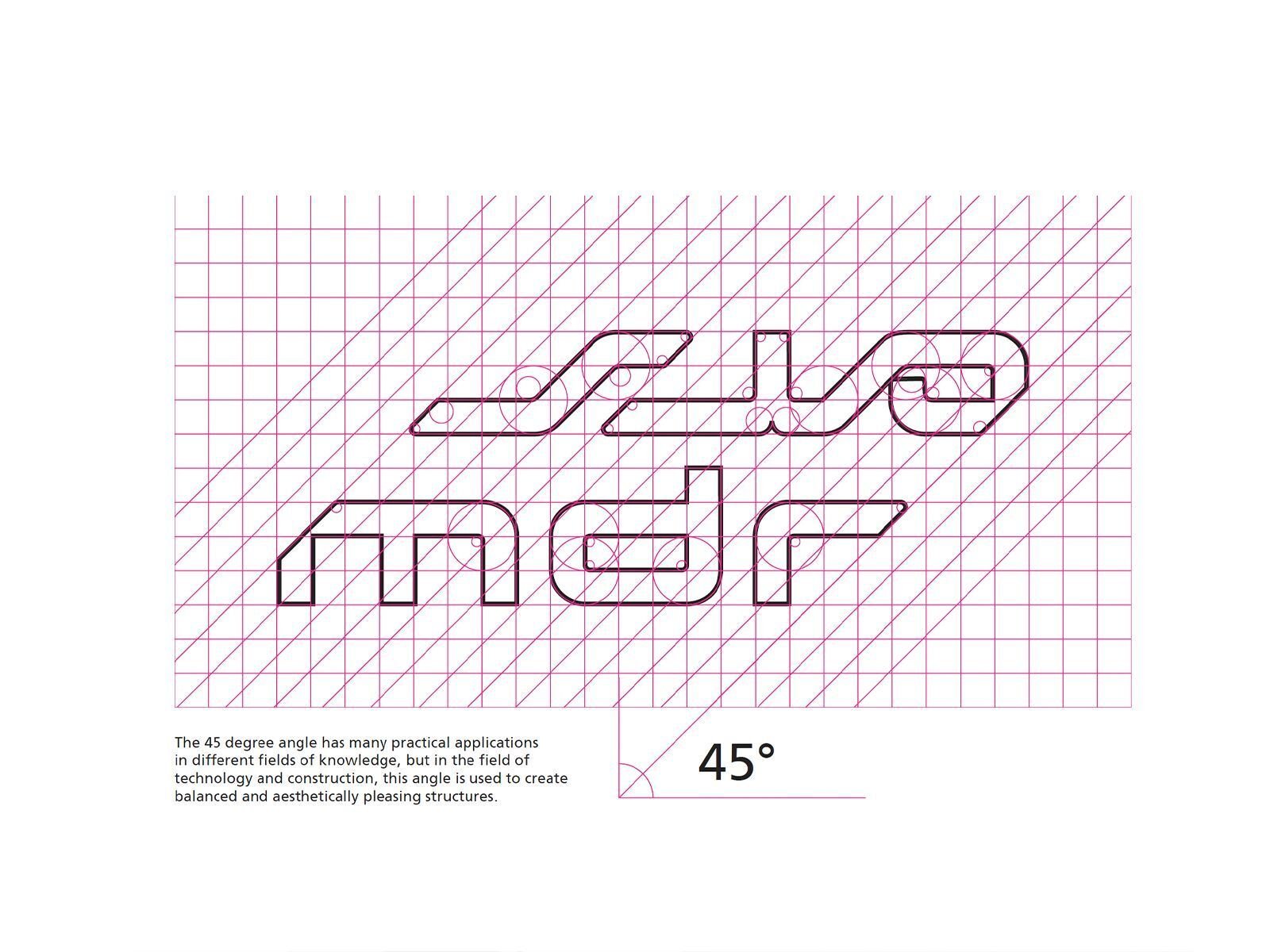
A bilingual logotype where Arabic and English share the same geometric DNA — built on a 45-degree slant, a diagonal precision that runs through every application. Four primary colors, each carrying a business arm: Rich Black for investments, Eco Green for development, Royal Blue for property and asset management, Vivid Burgundy for realty. Gold and silver reserved for the moments that matter.
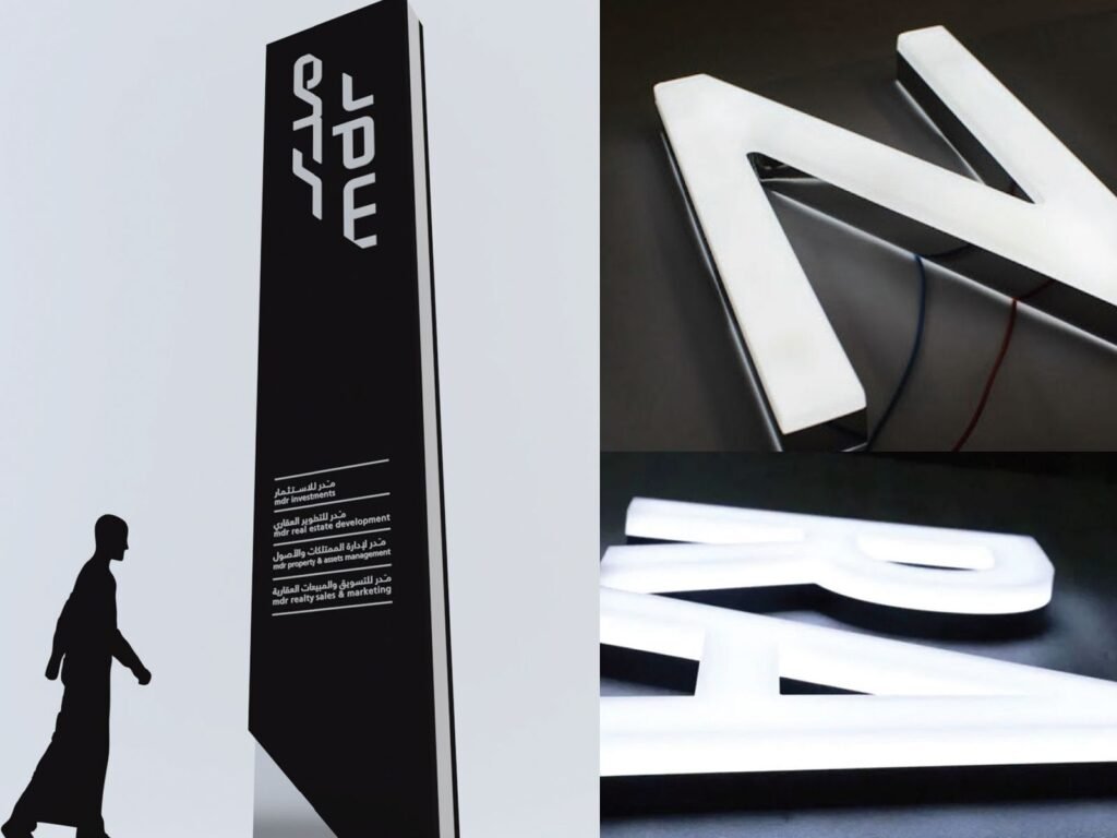
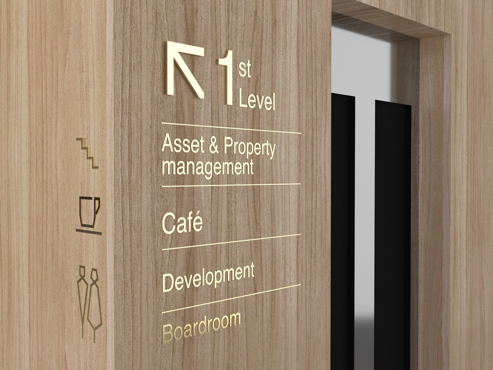
Frutiger LT Arabic across both languages — one typeface family, Roman for body, Black for headlines. A grid system. Wayfinding that turns every corner into a 45-degree angle. Glass decals at exactly 70cm from the ground, logo height 12cm. Outdoor signage with specified eye levels — 1830mm, 1220mm — because accessibility is not optional. Exhibition booths built from the pillars of the logo itself. Gifting that creates suspense before the reveal.
And an olfactory signature — Ward Taifi and Lavender diffused through every space. A sonic identity woven from local DNA. A hospitality menu of Saudi coffee, Turkish coffee, and stuffed dates served in glass, never plastic.
One system, from the pylon at the gate to the pin on the lapel.
The Proof
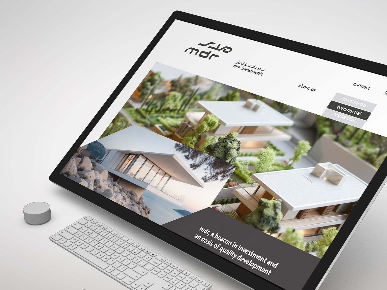
MDR now presents as one developer — four business arms under one visual language, one tone of voice, one standard. The brand system runs across print, digital, environmental, and sensory touchpoints without BrainDing in the room.
The result isn’t a manual. It’s a position.
MDR — a beacon in investment and an oasis of quality development.