MADAIN DEVELOPMENTS
Where Heritage Meets Tomorrow.
مجتمعات يطيب العيش فيها
The Situation
Madain was entering a crowded real estate market where every developer promised luxury, quality, and innovation. But most of them said it in the same way — generic, loud, and disconnected from the culture they were building within.
Madain wanted to be different. Not a traditional developer, but a visionary catalyst for urban transformation — rooted in Saudi cultural identity and inspired by global innovation. The brand needed to hold two things at once: the weight of tradition and the momentum of the future.
In a market full of developers, Madain needed to be seen as something else entirely. A partner. A place-maker. A custodian of culture and a builder of tomorrow.
The challenge wasn’t a logo. It was duality.
Science
Brand Foundation
We started with a question, not an answer: what does it mean to build a community that belongs to both its past and its future?
The answer became the brand’s operating doctrine. A brand essence built on urban transformation — deeply rooted in Saudi cultural identity, inspired by global innovation, dedicated to creating future-ready communities where sustainability, quality, and human-centric design converge.
Four values — Shaping the Future, Quality at the Core, Committed to Innovation, Rooted in Integrity. Each one a commitment, not a slogan. And a brand persona: the Visionary Architect — a cultural custodian and trusted advisor. Wisdom, elegance, forward-thinking. Calm confidence. A bilingual, respectful, inspiring voice.
One foundation. Four values. One vision. Never off-key.
Senses
Design & Development
Then we built what the market would feel.
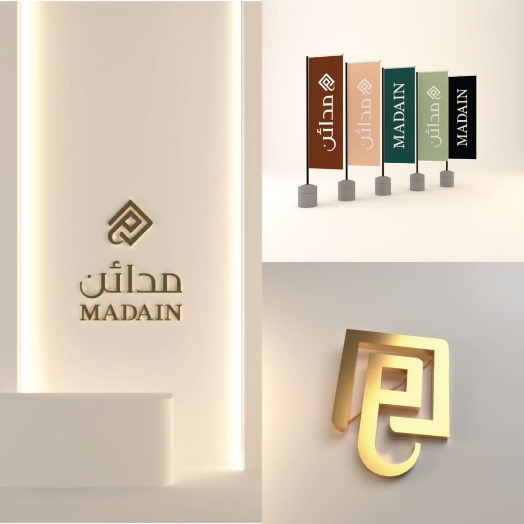
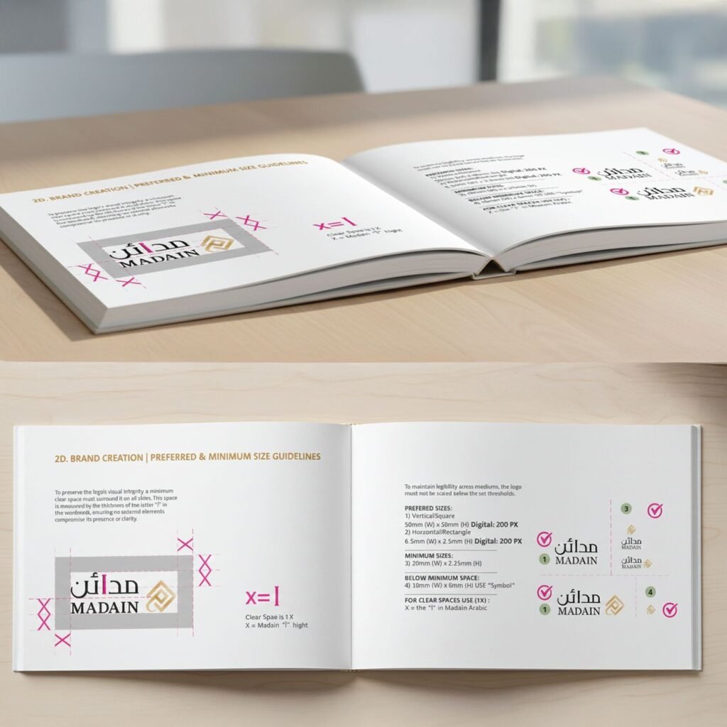
A logotype rooted in Riyadh’s city planning and the squared Kufic script — the Arabic letter “qaf” (ق) reimagined as an architectural symbol. A mark that is both typography and masterplan. The “f” of the wordmark becomes the clear space measure — the brand’s own geometry governing its own protection.
A color system of six primary colors — Almond Green, Soil Brown, Nature Green, Off White, Pale Orange, Solid Black. Plus Pantone Gold and Silver reserved for the moments that matter. A palette that looks like the Kingdom itself: earth, growth, light, and shadow.
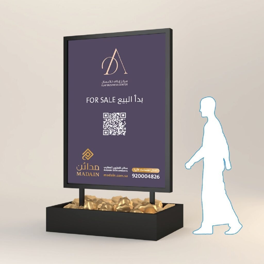
TheSansArabic across both languages — Light, Plain, Bold — one family, two scripts, modern and adaptable. A full system of logo variants for every surface and background. Co-branding formulas that allow Madain to endorse partners without losing its voice — the mark and the development name sharing one geometry.
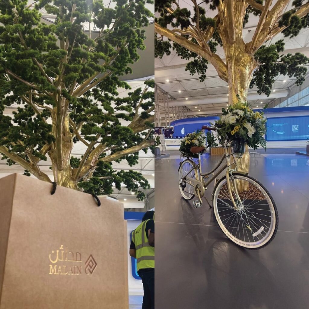
And a sensory layer that runs through every space. Woody and musky scents in corporate offices — confidence, warmth, professionalism. Lavender in the communities — calm, health, relaxation. A Gustatory menu of Saudi coffee, black tea, Turkish coffee, and dates served in glass. An environment policy — refuse, reduce, reuse, recycle.
Wayfinding icons built from the brand’s own 45-degree geometry. Signage systems calibrated to human eye levels — 1830mm for standing adults, 1220mm for wheelchair users, 1000mm for children. Because an inclusive brand measures itself against every person it serves.
One system, from the masterplan to the cup of Saudi coffee.
The Proof
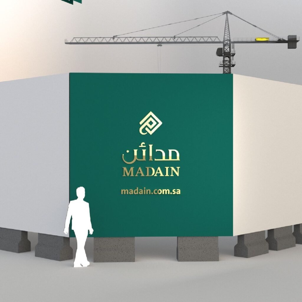
Madain now presents as one developer — a single brand system across corporate identity, real estate projects, community developments, and every touchpoint in between.
The brand system runs without BrainDing in the room. The cultural DNA of the mark travels across every application. The four values inform every decision. The communities themselves — AlFursan, Madain Village, and beyond — become living expressions of the brand.
The result isn’t a manual. It’s a position.
Madain Developments — Building Communities That Belong to Tomorrow.
See it live:
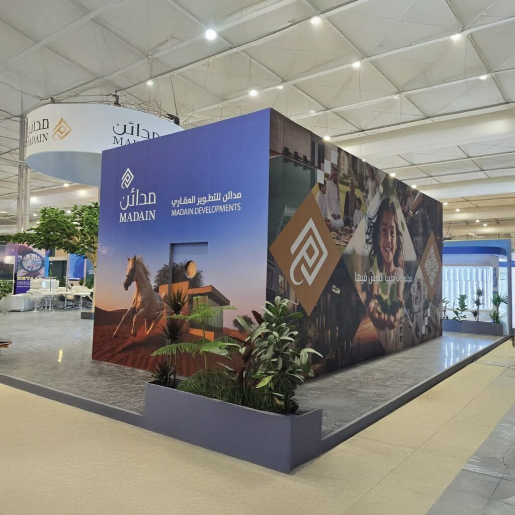
The brand system in the real world. Heritage made visible, from the masterplan to the community gate.