

FARGHALI
Nature’s Own. Nothing Added.
Fruit of Life.
The Situation
Farghali began twenty years ago with a simple conviction: that what people drink should come from trees and soil, not from formulas and factories. While the market flooded with sugar-based drinks offering no real nutritional value, Farghali chose the slower path — hand-selecting the finest fresh fruits and vegetables, then turning them into juices, smoothies, and snacks that families could trust.
The product was honest. The story was authentic. But the brand had not yet learned to speak with one voice.
In a category where shelf presence decides purchase and trust decides loyalty, Farghali needed to move from being *a* fresh juice company to being the natural first choice — recognised instantly, understood instinctively, and remembered by every parent looking for something better for their children.
Science
Brand Foundation
We started with the question the brand had been answering through its products but not yet through its identity: what does fresh actually look like when it becomes a brand?
The answer became Farghali’s operating doctrine. A brand essence built on nature’s own produce — nothing artificial, nothing added, nothing hidden. A vision to remain the natural first choice for healthy and tasty products. A mission to spread a culture of enjoying nutritious treats as an alternative to mass-market, sugar-based drinks. And seven values that read like a family recipe: Passion for Quality, Discipline, Dedication to Customer Service, Qualifications & Talent, Innovation & Creativity, Team Care & Teamwork, Fruitful Partnership.
One philosophy — Fruit of Life — expressed across every product, every touchpoint, every market.
Senses
Design & Development
Then we built what the market would taste before it tasted the juice.
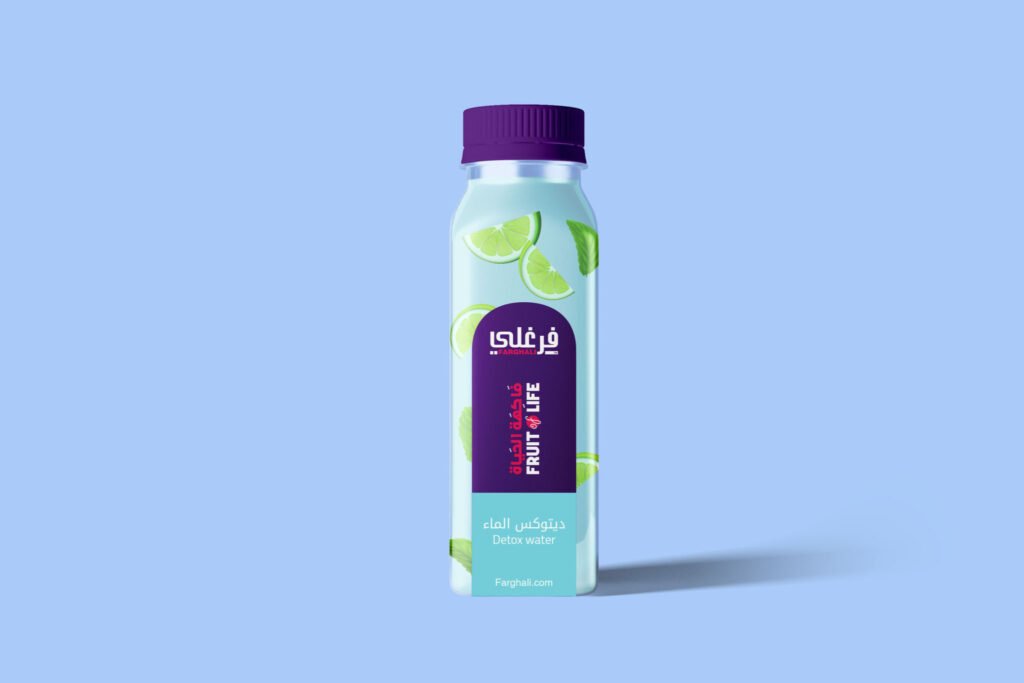
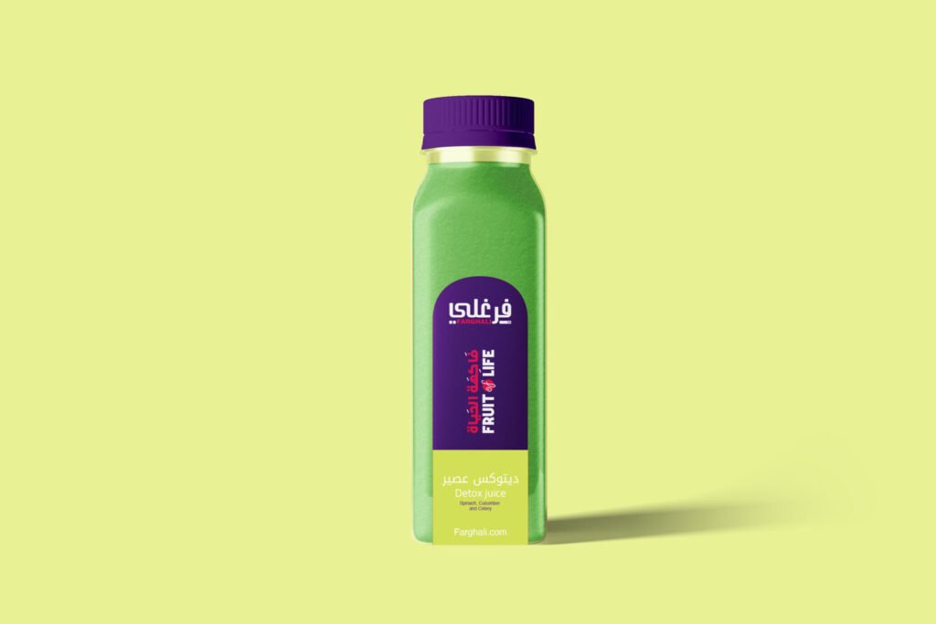
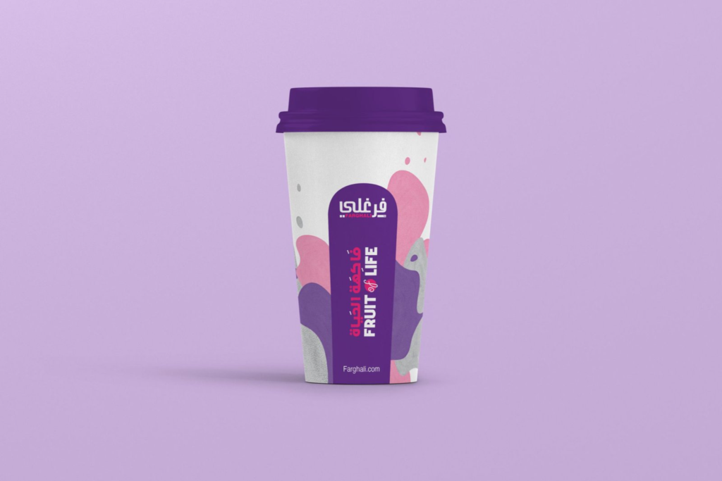
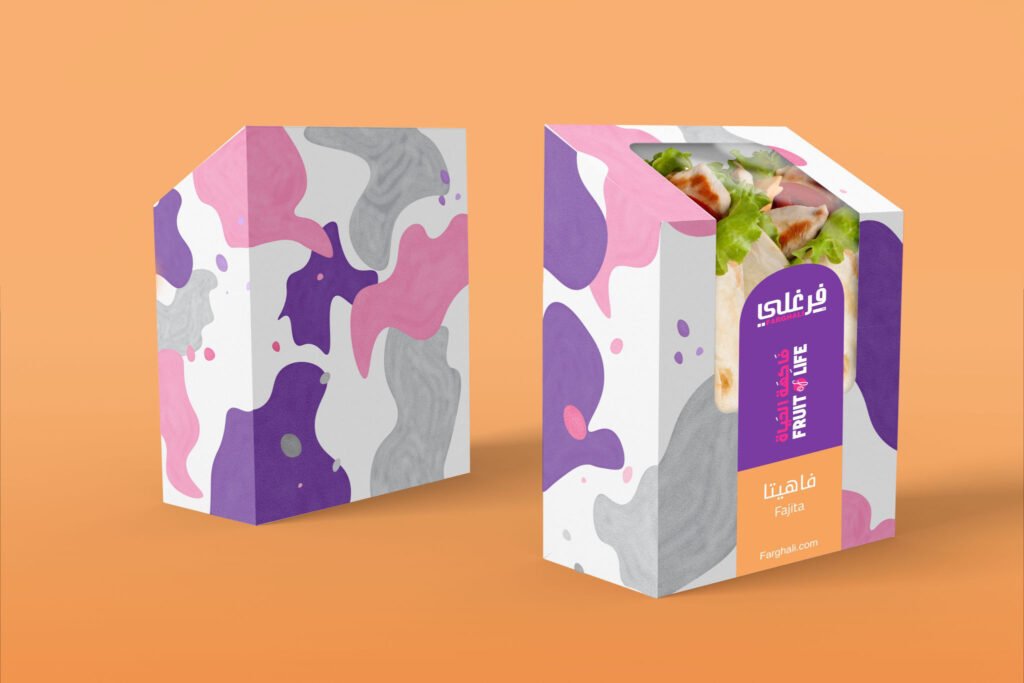
A bilingual logotype where Arabic and English sit in deliberate harmony — the Arabic leading, the English grounded beneath it. A brand mark built around the strawberry and the pineapple, drawn in clean, confident strokes. A colour system pulled straight from the fruit itself: Grapes Black, Strawberry Red, Apple Green, and Sky Blue — four colours, one orchard.
Typography anchored in Frutiger LT Arabic, built for bilingual clarity across headlines, packaging, and digital. A suite of hand-drawn fruit and vegetable icons. The circular Farghali Fresh — Daily Pezaeunbs seal. Packaging that lets the product speak — transparent bottles, honest labels, no preservatives, no additives, nothing to hide. And the full identity rolled out from bottle to boardroom: business cards, letterheads, uniforms, vehicle livery, tote bags, social templates, and the environment policy that refuses single-use plastic at the source.
One system, from the farm to the family table.
The Proof
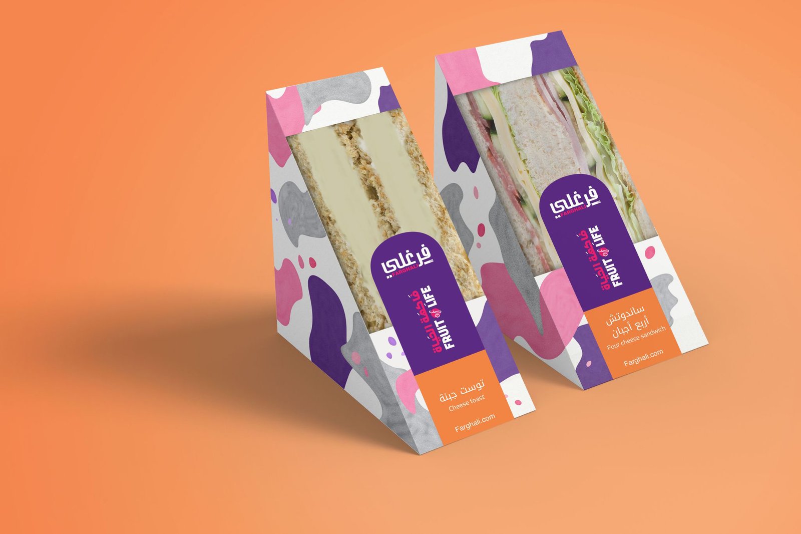
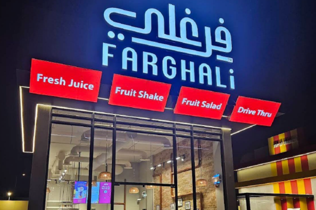
Farghali now presents as one national brand — a single promise of nature’s own produce, recognised across Riyadh and beyond. The bilingual identity works as hard as the juice does: on shelves, on delivery vans, on uniforms, on social feeds. The brand system runs on its own, in Arabic and English, without anyone having to explain it.
The result isn’t a label. It’s a promise.
Nature’s own produce. Freshly squeezed daily for you.
See it live:
The brand system in the real world. Nature made visible, from the fruit bowl to the family table.