
AWAL PLAZA
The First Plaza in Riyadh.
The Situation
Awal Plaza was entering a retail market where every strip mall looked the same — generic signage, undefined zones, and a navigation experience that left visitors circling the parking lot looking for their destination. The plaza had strong tenants — Hyper Panda, Starbucks, Baskin Robbins, Mothercare — but the brand itself was invisible. Tenants had equity. The plaza had none.
The problem wasn’t occupancy. It was orientation. Visitors couldn’t find their way, couldn’t remember where they parked, and couldn’t feel that they were in a place that had been designed for them.
Awal Plaza needed to become a destination — not just an address.
The challenge wasn’t a logo. It was clarity.
Science
Brand Foundation
We started with a question, not an answer: what does a “first” actually mean?
Awal — أول — means “first.” First in name. First in location. First in the mind of the visitor. And the numeral 1 became the entire doctrine: an identity built on the idea of primacy, priority, and place. One mark. One number. One system that could scale from the parking lot to the pylon to the badge on a security guard’s uniform.
The doctrine was practical, not poetic. A retail plaza is used, not admired. It’s navigated, not contemplated. So the brand foundation wasn’t built on abstract values — it was built on function. On making the visit effortless. On making the plaza feel designed for its visitors.
One number. Five zones. One experience. Never off-key.
Senses
Design & Development
Then we built what the visitor would feel.
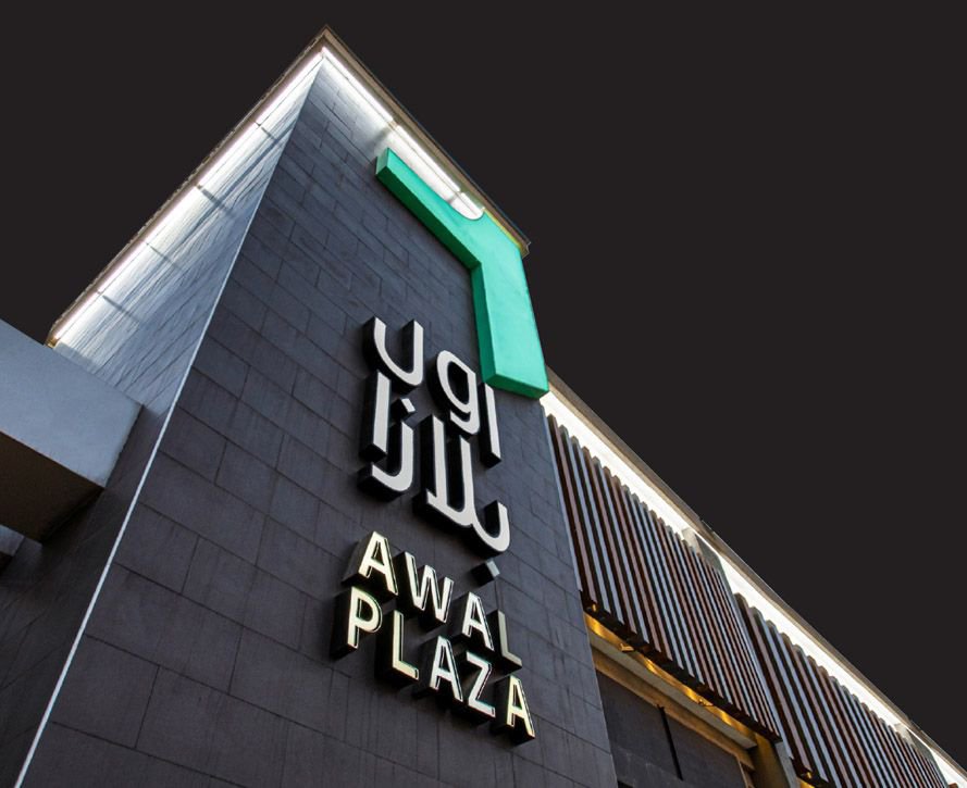
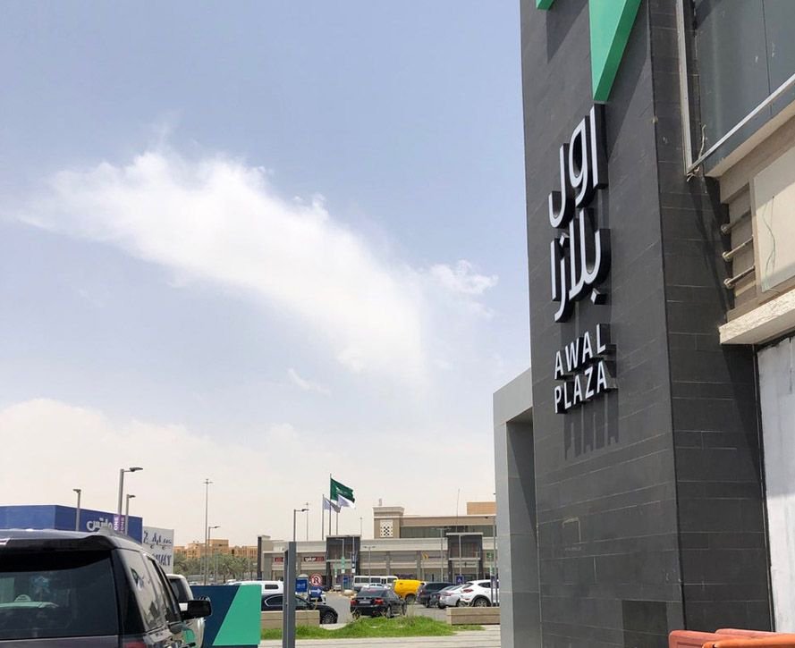
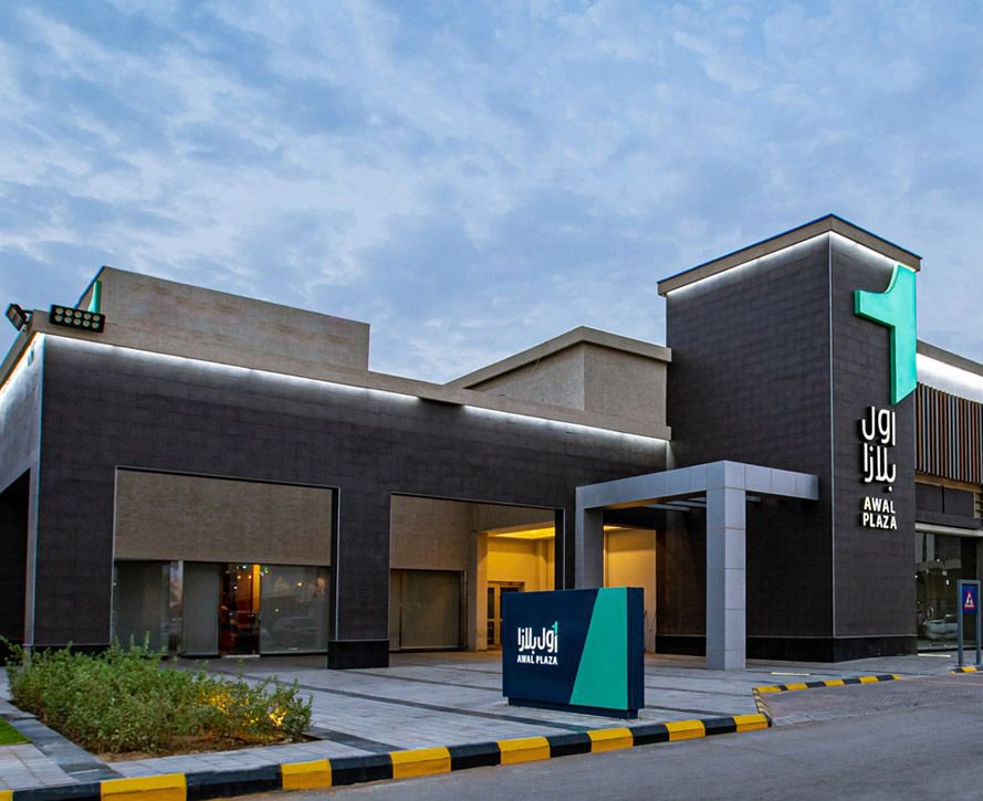
The identity begins with a single Arabic numeral — ١ — rendered in a clean, geometric form with a green flag rising from its top. The mark reads as both a number and a landmark: a flag planted on the ground, a location pinned on a map. The Arabic and English wordmarks — أول بلازا / AWAL PLAZA — carry the same clarity.
A two-color system — Awal Green and Awal Navy — with a supporting palette of zone colors that organize the entire experience:
- Zone 1 — Green (Hyper Panda)
- Zone 2 — Purple (Starbucks)
- Zone 3 — Grey (Baskin Robbins)
- Zone 4 — White (Mothercare)
- Zone 5 — Navy (Herfy)
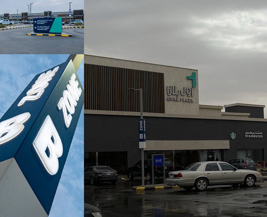
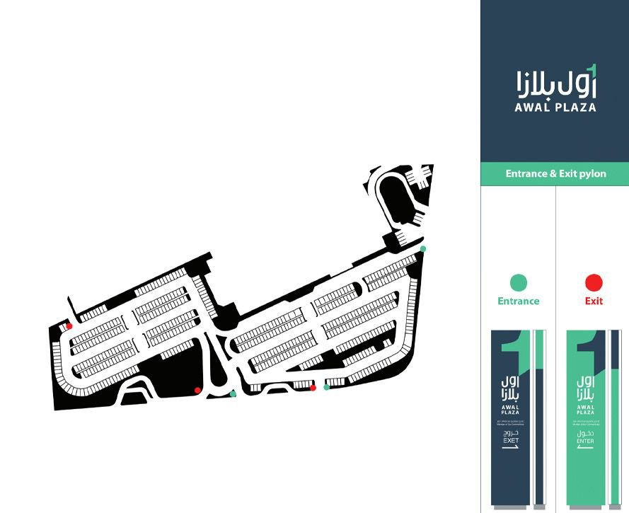
Five zones. Five colors. One code that runs through every touchpoint: signage, pylons, maps, badges, and even the entry and exit markers.
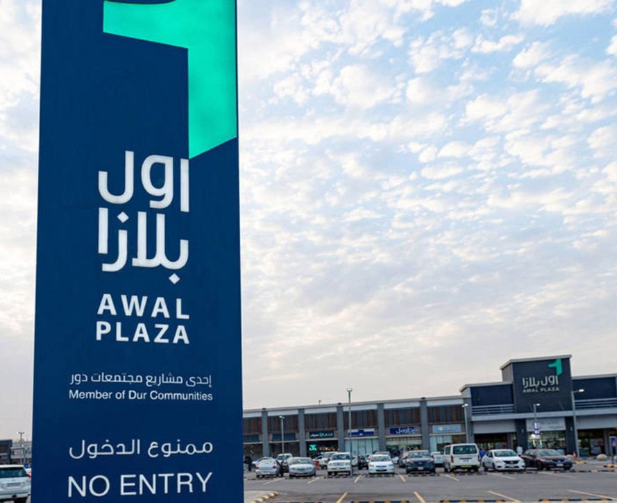
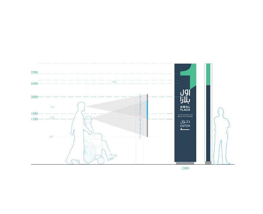
A wayfinding system built to human scale — pylons calibrated at 1830mm for standing adults, 1350mm for wheelchair users, and 800mm for children. Entry and exit pylons distinguished by green and red markers. Zone pylons with numbering and directional arrows. A full icon library for facilities, regulatory signs, and directional guidance — each one designed for immediate comprehension.
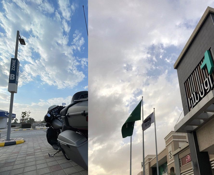
Environmental signage that turns the plaza into a readable system. Every entrance communicates. Every zone identifies. Every visitor knows exactly where they are, where they’re going, and where they parked.
One system, from the parking lot to the shopfront.
The Proof
Awal Plaza now presents as one destination — a clearly defined retail environment with five distinct zones, one navigation system, and one identity that lives in the visitor’s memory.
The brand system runs without BrainDing in the room. The number “1” travels across every application. The zone colors organize the experience. The signage works at human scale, for every visitor. And the plaza — finally — has a face that matches its tenants.
The result isn’t a manual. It’s a position.
Awal Plaza — The First. The One. The Plaza.
See it live:
The brand system in the real world. Clarity made visible, from the pylon to the parked car.