ALNAYFAH
لأنك آسرة
Where life finds its rhythm.
The Situation
AlNayfah entered the Saudi real estate market at a moment when gated communities were multiplying across the Kingdom. Every developer promised the same things: security, amenities, landscaping, and a “lifestyle.” The category had become visually and verbally repetitive — the same renderings, the same adjectives, the same stock imagery of smiling families.
AlNayfah had something the others didn’t: a name rooted in the Arabic idea of purity, clarity, and refinement — النايفة — a word that describes something elevated, unblemished, and placed exactly where it belongs. The community itself was designed around that idea: a place where every element, from the streetscape to the smallest detail, sits in its right place. But the brand hadn’t yet translated that idea into a visual and verbal language that could compete in a crowded market.
The gap wasn’t the community. It was the clarity.
Science
Brand Foundation
We started with the name. What does AlNayfah actually mean to a family choosing where to live?
It means a place that is right — not just good, not just safe, but right. A community where the details have been considered, where the environment has been designed rather than assembled, and where the word “home” carries its full weight. That reading became the operating doctrine.
A brand essence built on everything in its right place — the idea that a home is not just a location but an alignment of people, place, and detail. A positioning that treats AlNayfah not as another compound, but as a considered environment where the culture of the place is as important as the amenities. A visual language built on the cornerstones of people, place, and details — with photography guidelines that reject staged smiles in favour of genuine moments, natural light, and the quiet textures of daily life.
One idea — right place, right life — expressed across every touchpoint, from a render to a resident’s morning.
Senses
Design & Development
Then we built what a family would feel before they visited.
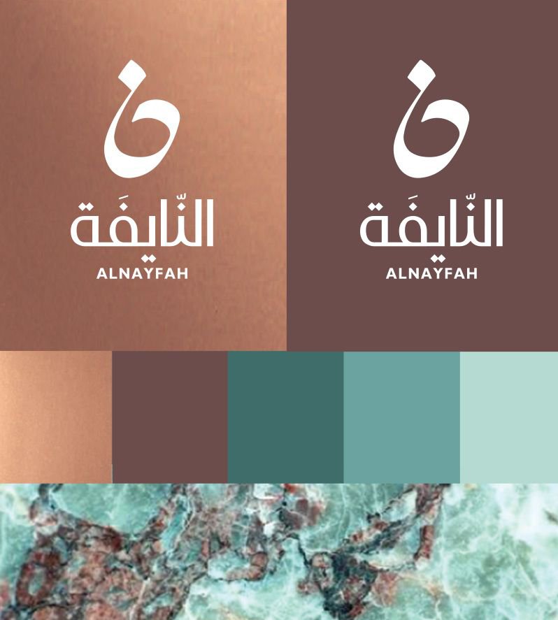
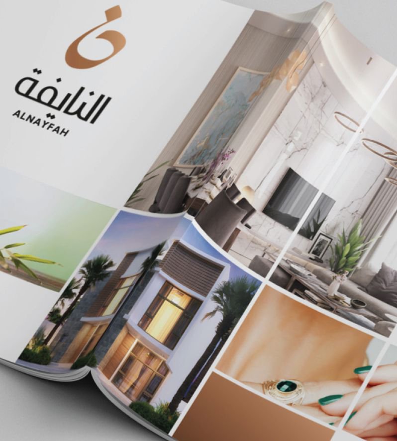
A logotype where the Arabic letter ن — the first letter of AlNayfah — is drawn as a single, fluid calligraphic gesture, derived from a circular grid that gives the mark its geometry and balance. The Arabic wordmark النايفة sits beneath in a composed, contemporary face, with ALNAYFAH anchored below in a light Latin typeface. A colour palette drawn from the natural world: a Copper Texture, Pantone 7616 C, Pantone 561 U, Pantone P 12-129 C, and Pantone 566 C — earthy, calm, and deeply rooted in the landscape of the community. The palette is introduced by a marble texture that locates the brand in the material world of stone, mineral, and permanence.
And the system extended to the guidelines that matter most for a place: clear space rules, logo placement rules (corners or centre bottom, never in the middle), size specifications (26mm × 40mm standard, 13.5mm × 20mm minimum), and a photography direction built on three pillars:
- The People — cast as genuine Saudis with natural expressions, in real life situations, inviting the viewer to say “Yes, this is me.”
- The Place — not the generic amenities, but the mood of the community and the AlNayfah culture.
- The Details — the small things that make living memorable: a warm cup, a garden in bloom, a shot that fades away so the environment, not the model, is the subject.
One identity, from the masterplan to the morning coffee.
The Proof
AlNayfah now presents as one community with one recognisable identity — a place that can be described in a sentence, photographed with a point of view, and recognised without a caption. The calligraphic ن mark, the copper-and-teal palette, and the photography direction travel from a billboard to a brochure to a resident’s social feed without losing their voice.
The brand system runs in Arabic and English, in print and digital, without anyone having to explain the concept. That was the point.
The result isn’t a compound. It’s a culture.
The community where everything is in its right place.
See it live:
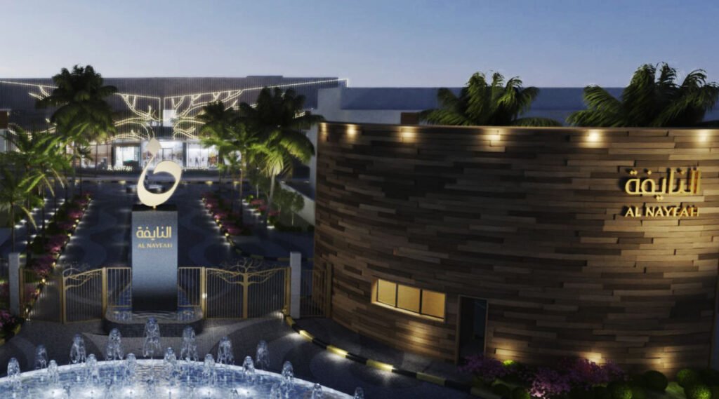
The brand system in the real world. Right living made visible, from the masterplan to the moment.