FONOON INDUSTRIES
Infinite Possibilities.
Architectural Masterpieces, Materialized.

The Situation
Fonoon Industries had mastered the materials — GRC, GRP, GRG, UHPC, and Aluminum — and built a reputation for precision across Saudi Arabia’s most demanding projects. What the company hadn’t yet done was materialize itself.
In a sector where the work is architectural and the clients are ministries, developers, and global contractors, a manufacturer is judged twice: once on the finish of the product, and once on the clarity of the brand standing behind it. Fonoon had the first. The second was scattered across inconsistent applications, multiple logo versions, and a name that carried no visual idea.
The market needed to see a company that could shape concrete and aluminum into art. It was seeing a supplier. The gap wasn’t capability. It was identity.
Science
Brand Foundation
We started with the name itself. Fonoon — فنون — means arts. Not manufacturing. Not contracting. Arts. That single word reframed everything the company actually does: they don’t pour concrete, they materialize architectural masterpieces. The insight became the operating doctrine.
A brand essence built on infinite possibility — the idea that when skill, material, and imagination converge, the only limit is the brief itself. A vision to become the leading supplier and manufacturer of architectural products through strategic partnership. A mission rooted in precise project studies, engineering compliance, and continuous refinement of both product and people. Three values that read like a code of craft: Sustainable Excellence, Employee Engagement, Customer Confidence.
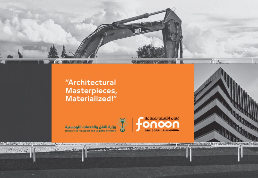
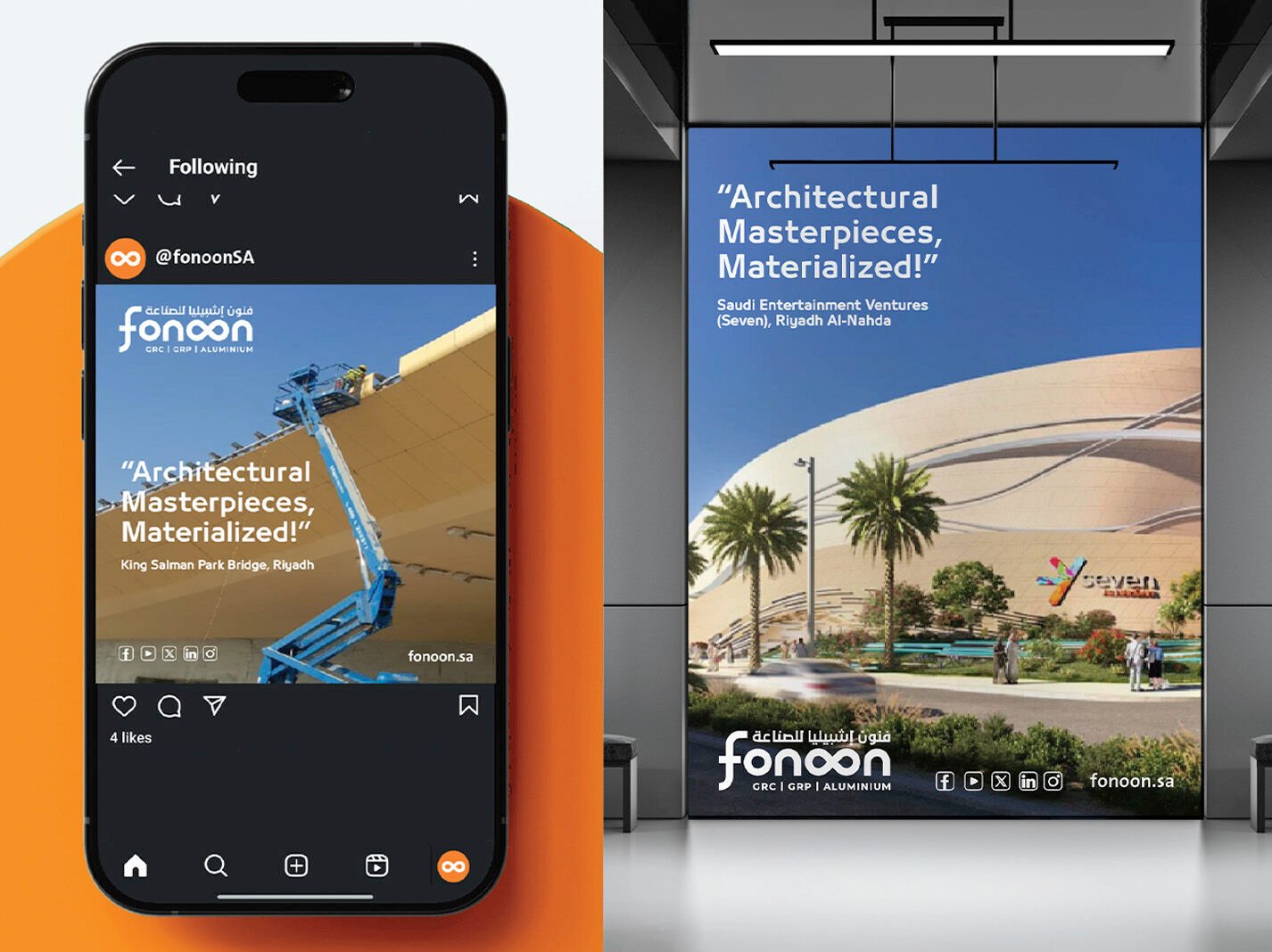
One motto, carried from the boardroom to the job site: Architectural Masterpieces, Materialized!
Senses
Design & Development
Then we gave the idea a form the industry would recognise before it read a word.
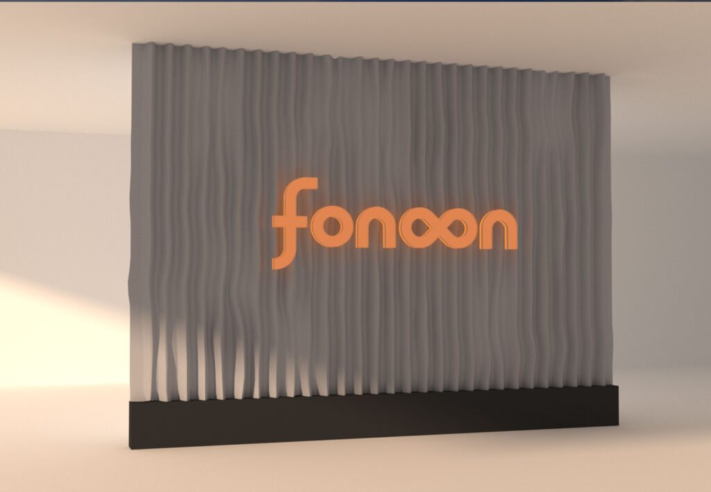
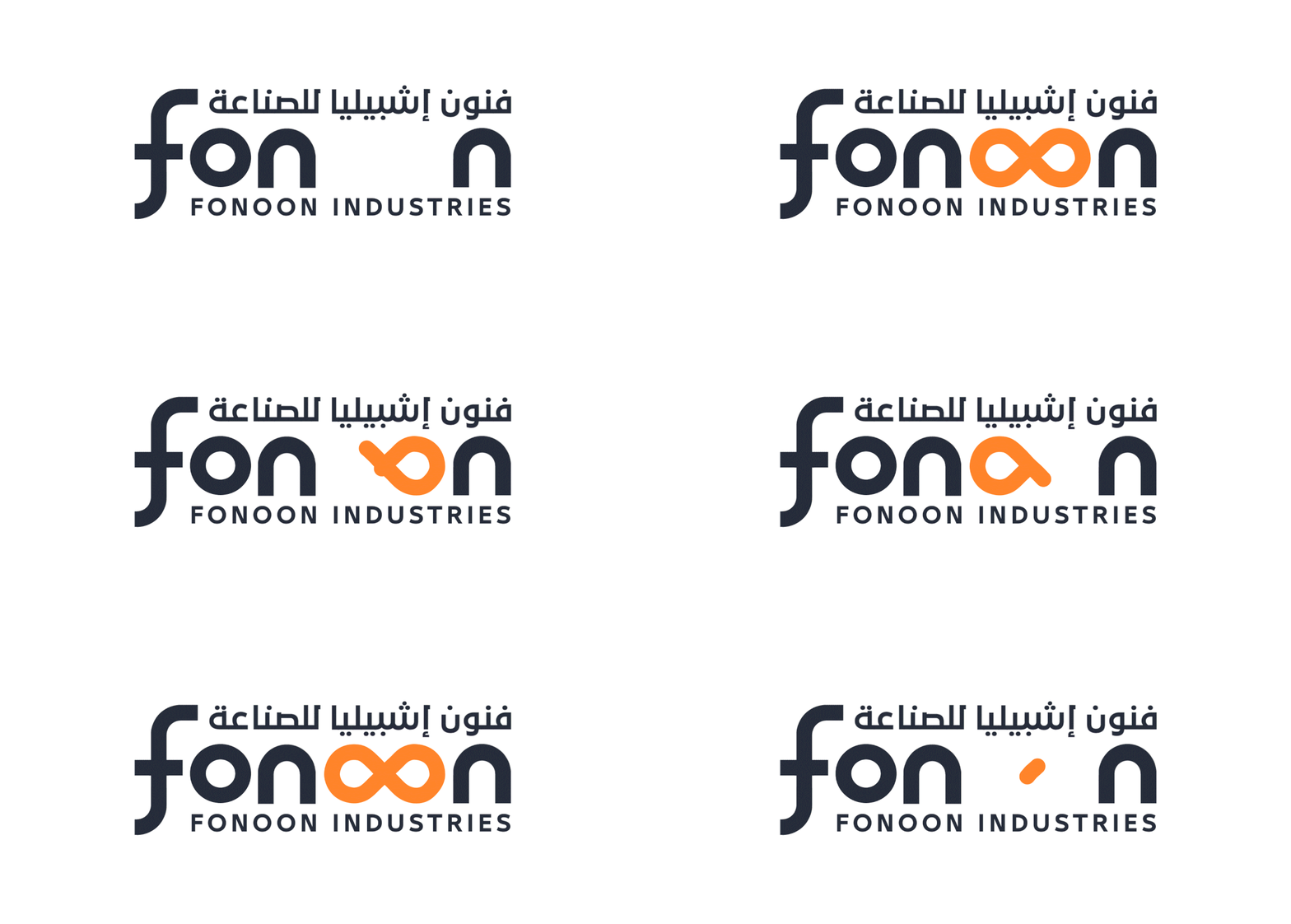
A logotype where the double-O of fonoon becomes an infinity symbol — the brand concept rendered as a single, ownable gesture. The Arabic and English marks built to sit together in deliberate hierarchy. A bilingual structure that lets the logo shift between primary legal, commercial, and secondary applications without ever losing recognition. A colour system anchored in Gold Drop and Blaze Orange against Dark Charcoal and Gunmetal — industrial, warm, and unmistakably Fonoon. Typography built on 29LT Bukra across Arabic and English. A photography philosophy rooted in the rule of thirds, natural light, and clean material focus.
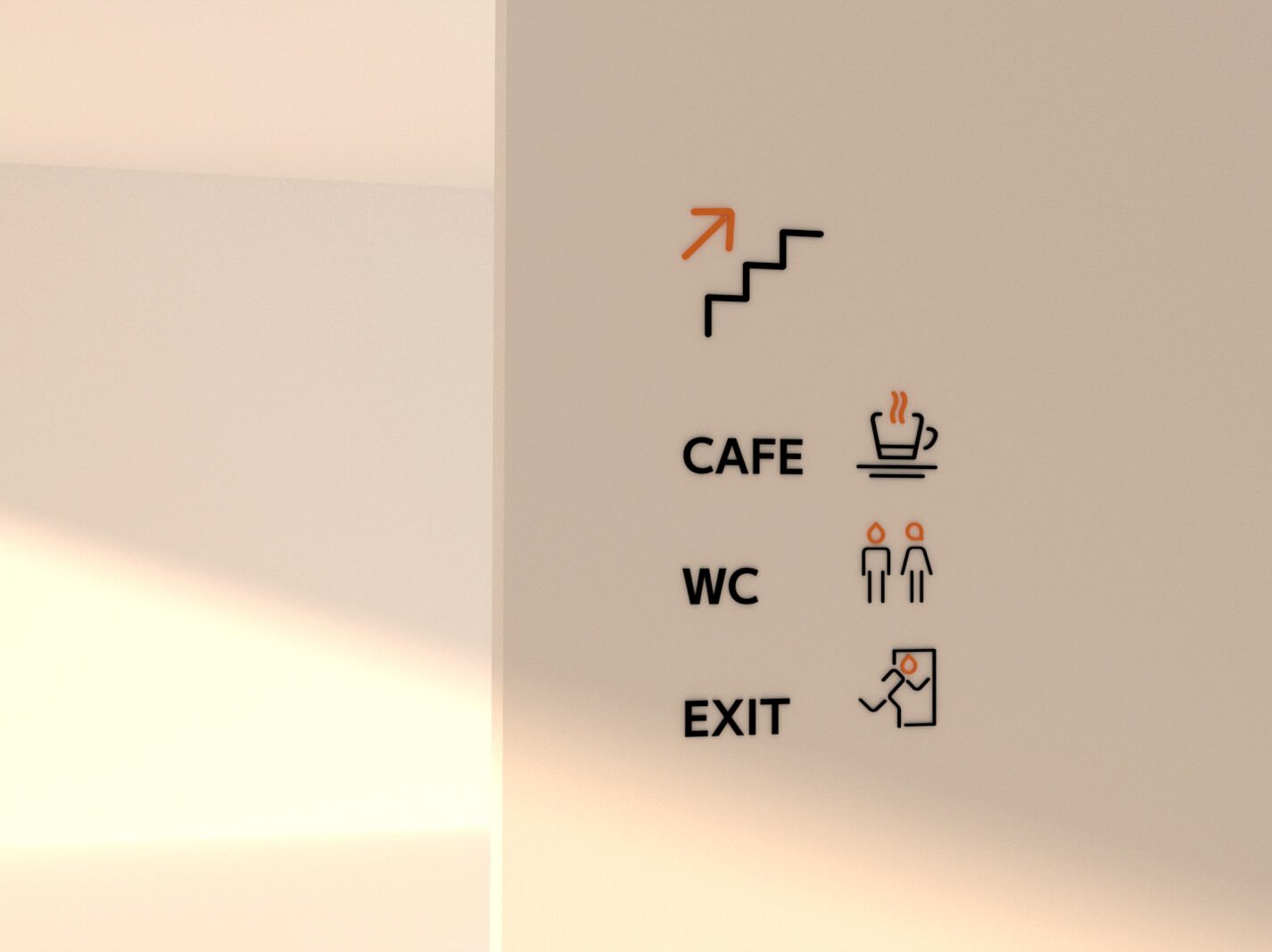
And the system extended to every place the brand is felt: business cards, letterheads, envelopes, co-branding protocol with partners like the Ministry of Transport and Logistic Services, social templates, gifting built from the materials themselves — a concrete-and-glass planter carrying the mark — wayfinding icons, site signage, fleet livery, field uniforms, hospitality dress in gunmetal with the infinity pin, and a gustatory house style that treats coffee and dates as part of the brand.
One idea, from the factory floor to the majlis.
The Proof
Fonoon now presents as one national manufacturer with a single, recognisable identity — a partner to ministries, developers, and global contractors rather than a vendor among many. The infinity mark does the work of a signature: it says arts, it says infinite, it says Fonoon — in Arabic and English, on a hard hat or a letterhead, at a project site or a partnership signing.
The brand system runs without explanation. That was the point.
The result isn’t a catalogue. It’s a position.
The region’s integrated manufacturer of architectural masterpieces.
See it live:
The brand system in the real world. Craft made visible, from the production line to the skyline.