ORNAMENT ENGINEERING
From Theory to Reality.
The vital link between concept and construction.
The Situation
Ornament Engineering had built its reputation on something most consultancies can’t claim: the ability to take a design idea and make it constructible. Drafting and design in BIM and Revit, project controls, procurement, quality assurance, forensic engineering, expert witness testimony. The work was deeply technical and genuinely valuable — the kind of service that keeps a project moving from paper to site.
But the brand didn’t communicate any of that.
In a sector where clients are developers, architects, contractors, and regulators, the firm was presenting itself as a generalist consultant rather than the specific, specialist link it actually is. The market saw a name and a logo. It didn’t see the discipline, the precision, or the range of services that made Ornament worth choosing.
The gap wasn’t expertise. It was positioning.
Science
Brand Foundation
We started with the role, not the résumé. What is Ornament Engineering, in one sentence?
The answer came back clearly: the vital link between design theory and practical application. The firm doesn’t design buildings — it translates critical design concepts into workable shop drawings for tangible, buildable end-products. That translation role became the operating doctrine.
A brand essence built on precision as a bridge — between concept and construction, between regulator and contractor, between an idea and a delivered project. A vision to be acknowledged for steadfast commitment to high-quality engineering consulting and project design services. A mission to create value through a structured framework with a personalized professional touch. Four values that read like a project charter: Exceeding Expectations, Leading by Example, Creative Thinking, Commitment to Quality.
One idea — the link — expressed across every service, every drawing, every approval.
Senses
Design & Development
Then we built what clients would recognise before they read a proposal.
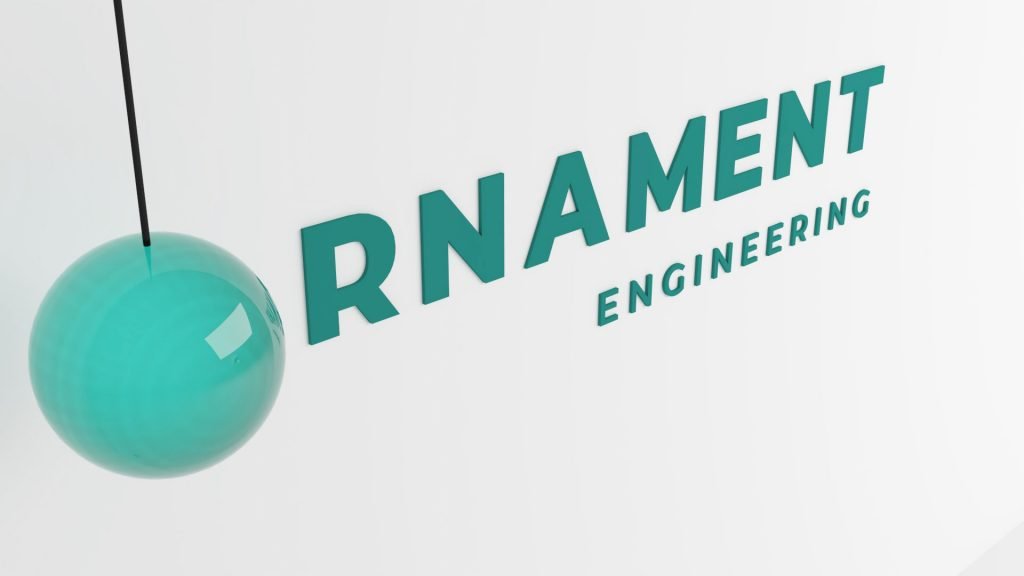
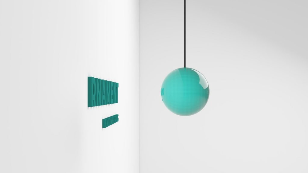
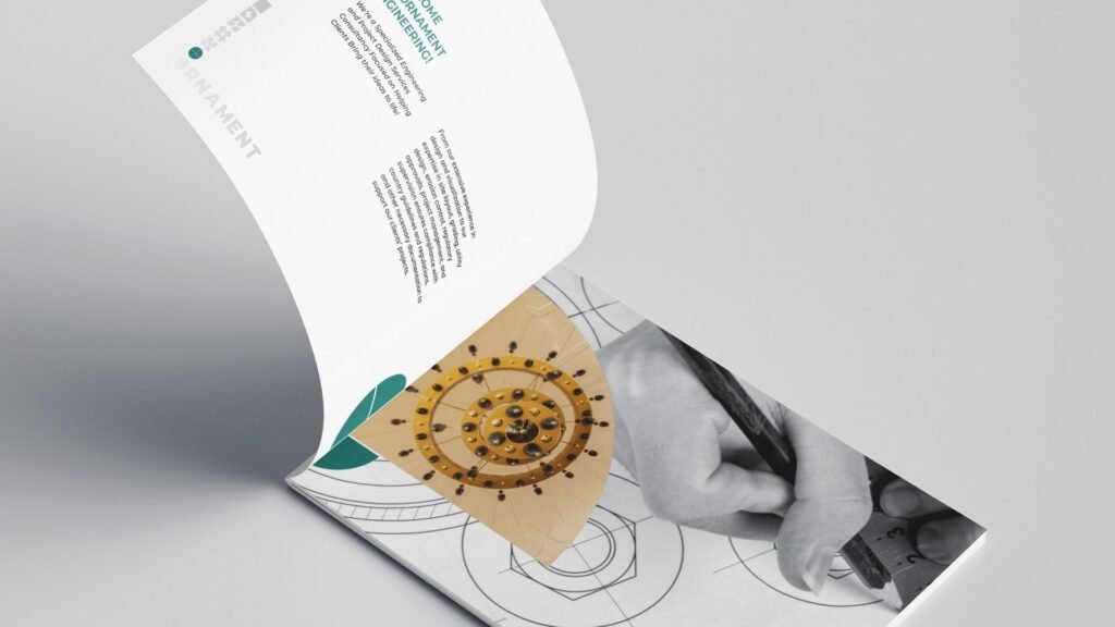
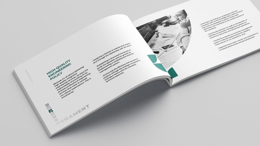
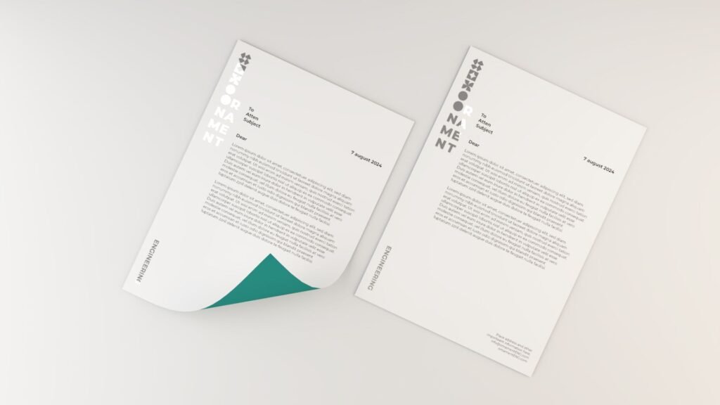
A logotype where the letter ‘O’ becomes a solid circle — a modern, ownable gesture that turns a generic word into a mark. A bilingual structure where ENGINEERING sits beneath in a lighter, smaller weight, creating a professional and balanced hierarchy. A geometric pattern system derived entirely from the circle — quarter circles, half circles, segmented shapes arranged in symmetrical, grid-like structures in shades of green and teal. A colour palette of deep green, teal, and silver that reads as technical and calm at once. Typography built on Montserrat across Arabic and English.
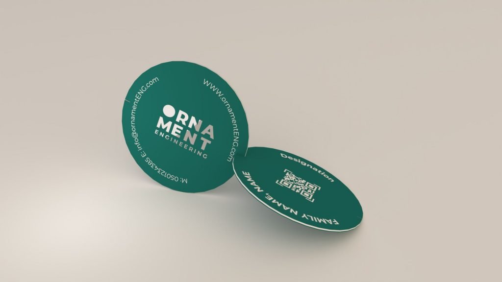
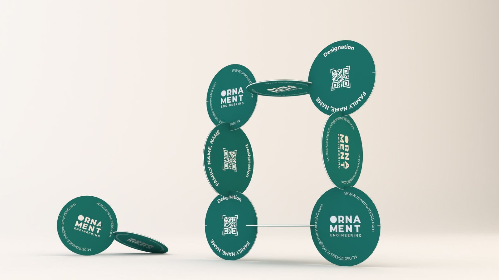
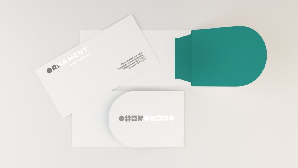
And the system extended to every place the brand is encountered: a circular QR business card with side cuts that let recipients physically build structures from them — the brand concept rendered as a touchable object. Letterheads with silver-stamped vertical logos. Social media profiles and post templates built around the circle-and-segment pattern. Office signage. A brand pattern designed to work across textiles, wallpapers, and graphics.
One system, from the drawing board to the site office.
The Proof
Ornament Engineering now presents as one firm with one recognisable identity — a specialist consultancy that clients can describe in a sentence, rather than a generalist they have to explain. The circle mark, the segment pattern, and the structured logo system travel from a business card to a LinkedIn profile to a site sign without losing recognition.
The brand system runs in Arabic and English, in print and in digital, without anyone having to defend it. That was the point.
The result isn’t a brochure. It’s a position.
The engineering consultancy that turns design into buildable reality.
The brand system in the real world. Precision made visible, from the first shop drawing to the final approval.