WALLAN HOLDING CO.
Determination. Entrepreneurship. Courage. Foresight.
Where legacy meets tomorrow.
The Situation
Wallan Holding had grown over four decades from a modest local enterprise into one of Saudi Arabia’s leading family-owned conglomerates — automotive, aviation, real estate, and beyond. But the brand had grown in fragments. Each division carried its own expression. Each touchpoint told a slightly different story.
The problem wasn’t legacy. It was coherence. A group with forty years of trust deserved a brand that made that trust visible — one identity that could hold automotive showrooms, aircraft hangars, corporate offices, and everything in between.
And it had to carry something deeper: the values of the founder. Captain Saad Al-Wallan. A man whose principles — work ethic, respect, commitment — had built the company. The brand needed to make those values felt, not just stated.
The challenge wasn’t a logo. It was alignment.
Science
Brand Foundation
We started with a question, not an answer: what does “We” mean for a family-owned conglomerate?
The answer became the brand’s operating doctrine. A single word — “We.” “We are Wallan Holding Co. Together We can do better.” Every message, every touchpoint, every decision measured against that pronoun.
The doctrine became the brand’s five pillars of respect: Respect for Employees. Respect for Perfection. Respect for Communication. Respect for Community. Respect for Continuous Development. Not values on a wall — operating principles for how the group behaves.
And behind it all, the founder’s spirit: determination, entrepreneurship, courage, and foresight. The brand persona of the Falcon — a symbol of vision, precision, and the courage to soar.
One foundation. Five respects. One “We.” Never off-key.
Senses
Design & Development
Then we built what the market would feel.
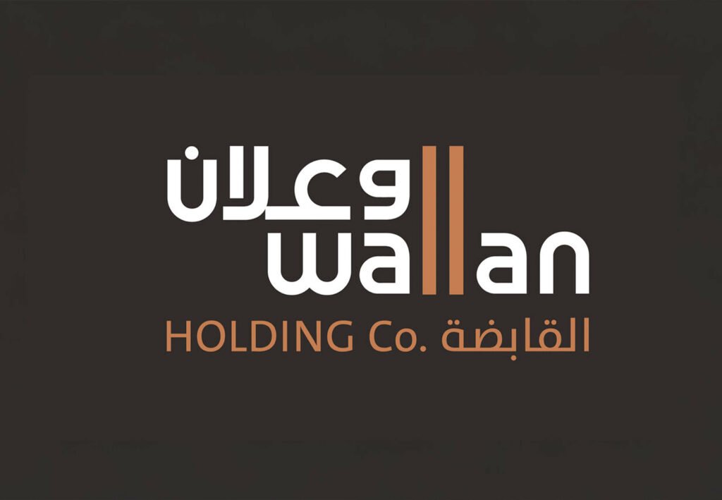
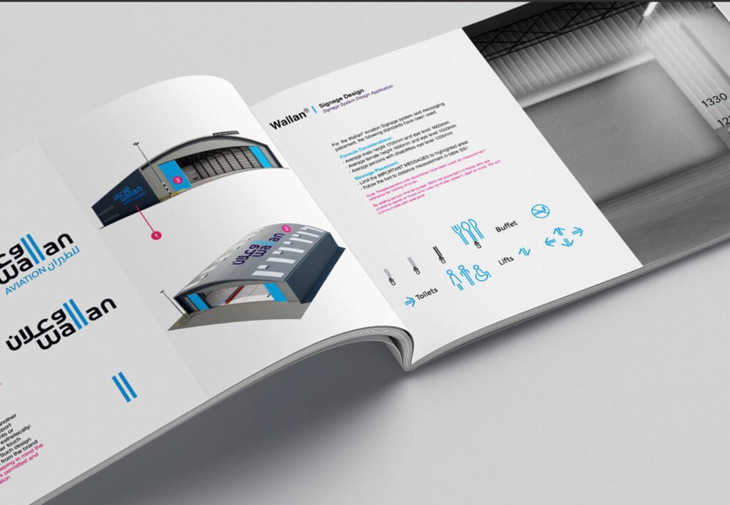
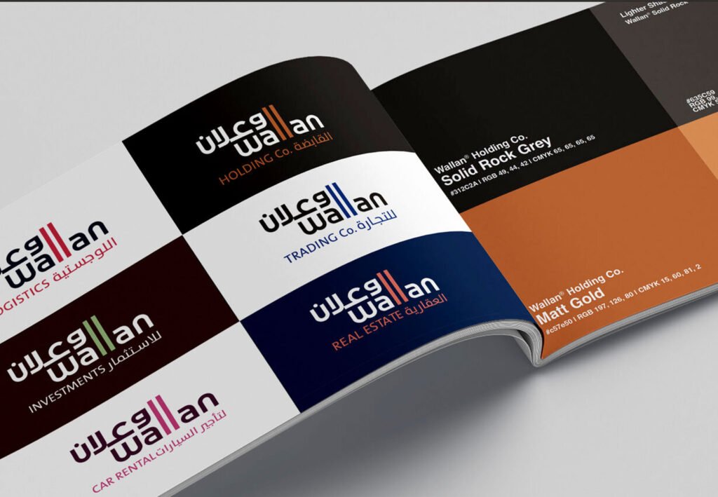
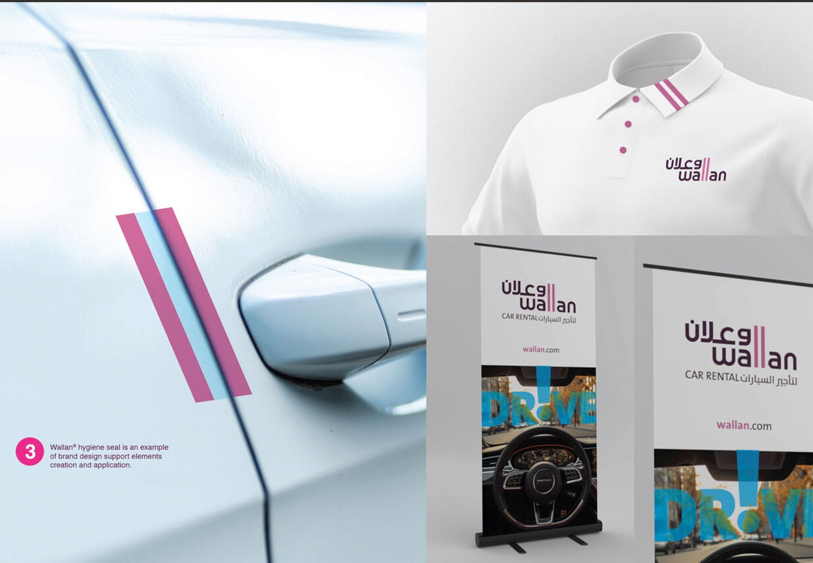
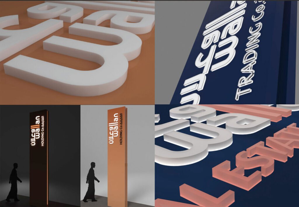
A bilingual logotype built on a simple, powerful idea — the double “ll” of Wallan becoming the brand’s signature device. Two vertical strokes in Wallan Matt Gold, standing apart, standing together. They run through every application: on signage, packaging, uniforms, glass, and cufflinks. The “ll” became the brand’s DNA.
Two primary colors. Wallan Solid Rock Grey — the weight, stability, and professionalism of forty years. Wallan Matt Gold — the achievement, warmth, and human excellence that built the group. A supporting palette of tinted greys and golds, plus a single highlight blue. Restraint as a statement.
TheSansArabic across both languages — one typeface family, Plain for body, Bold for headlines, SemiLight for quotes. A 12-column digital grid. Print templates for letterhead, business cards, envelopes, and notebooks. Co-branding formulas with partners like Hyundai — Wallan at 110% of partner logo — so the brand never loses its presence at the point of collaboration.
And a sensory layer that runs through the entire group. Jasmine and Lavender diffused through every office. A Gustatory menu of Saudi coffee, local tea, cucumber water in glass, and fancy dates. An environment policy — refuse, reduce, reuse, recycle — that says the brand has a conscience.
One system, from the falcon at the gate to the cup of Saudi coffee.
The Proof
Wallan Holding now presents as one group — one visual language, one tone of voice, one standard — across automotive showrooms, aviation facilities, corporate offices, and every partner touchpoint in between.
The brand system runs without BrainDing in the room. The “ll” device travels everywhere. The “We” voice carries through every communication. The five pillars of respect inform every decision.
The result isn’t a manual. It’s a position.
Wallan Holding Co. — Building Excellence Across All Horizons.
See it live:
The brand system in the real world. Forty years of trust, made visible in a single mark.