PREMI®
Forward-Looking Healthcare Solutions.
Made in KSA. Trusted by the world.
The Situation
Premi® — Premier Medical Devices Manufacturing Co. — was entering a market where trust is the product. A medical device manufacturer doesn’t sell a product; it sells reliability. It sells the confidence that a monitor will read correctly, that a device will function when a life depends on it.
The Kingdom’s healthcare system was evolving fast. Vision 2030 demanded local manufacturing capacity. But in a sector where global players had decades of brand equity, a new Saudi manufacturer needed more than a factory. It needed a brand that could stand beside the world’s best — and belong to the nation it serves.
Premi had the capability. It needed the identity to match.
The challenge wasn’t a logo. It was credibility.
Science
Brand Foundation
We started with a question, not an answer: what does reliability actually look like when it’s manufactured?
The answer became the brand’s operating doctrine. A vision to improve the healthcare system by manufacturing forward-looking products of the best possible reliability and quality. A mission to improve patients’ lives by identifying, developing, and commercializing those products — assisting healthcare providers in the Kingdom and beyond.
Four values — Humanity, Integrity, Passionate Dedication, Teamwork. Each one a commitment, not a slogan. And a brand promise that says it plainly: we promise to meet the trust and expectation placed in us.
One foundation. Every device. One standard. Never off-key.
Senses
Design & Development
Then we built what the market would feel.
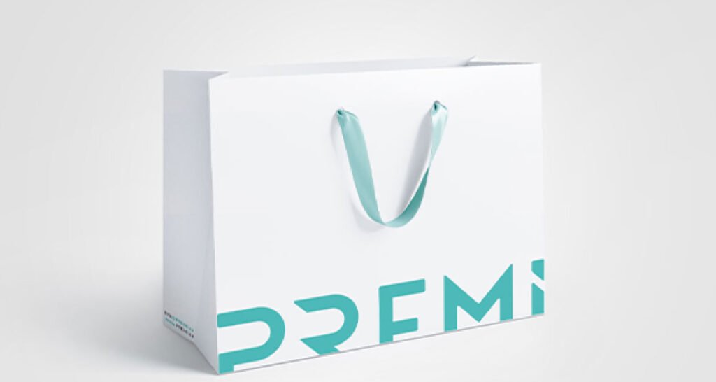
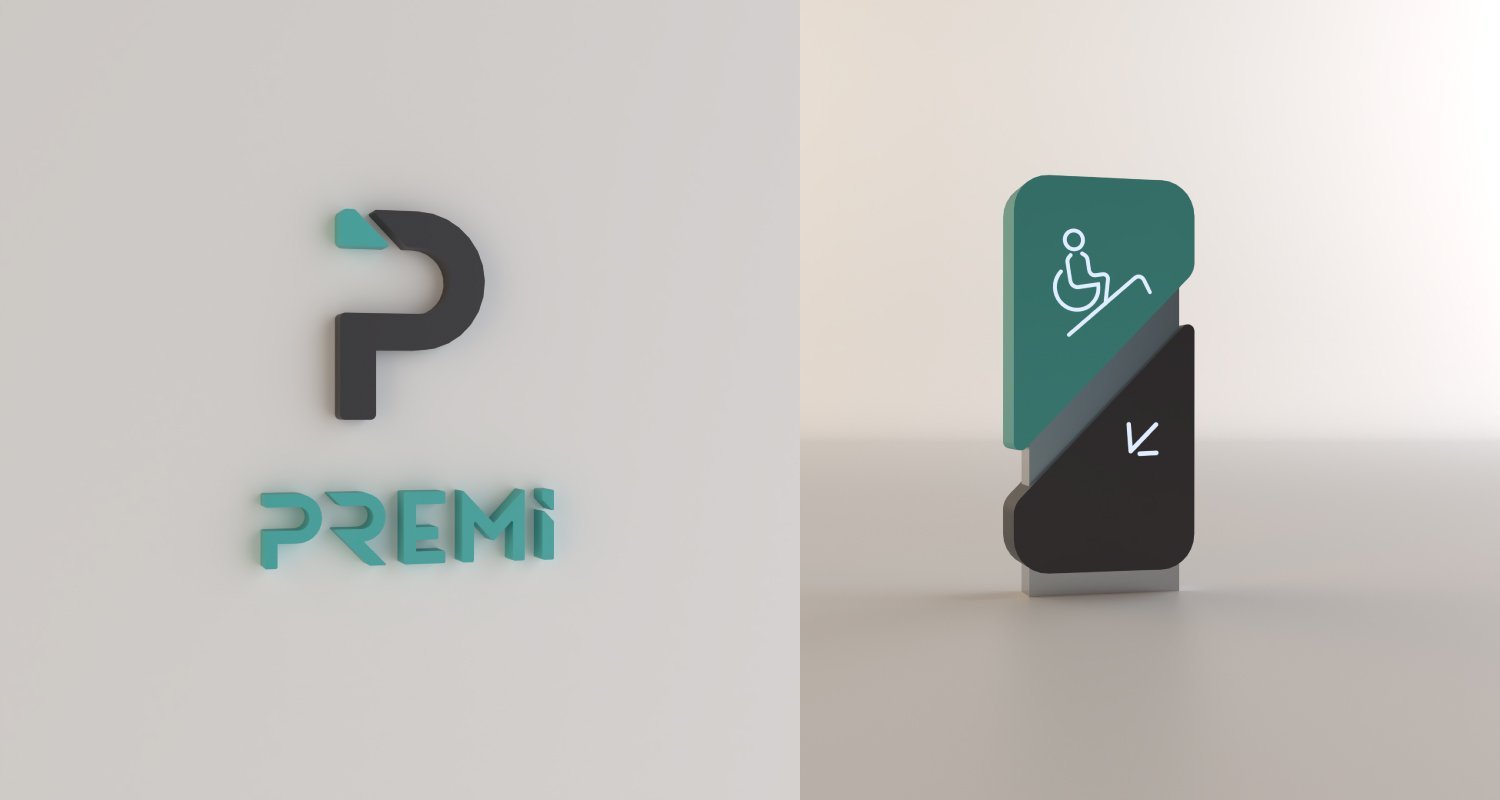
The Premi® logotype begins with the letter P — but not as a letter alone. The mark is drawn as if it were cut from a production line: a clean, precision-engineered form, with a single angled cut in the top-left corner that reads as a manufactured piece. The cut is the brand’s signature — a quiet reminder that everything Premi makes comes off a line, to specification, with discipline.
A color system built on Modern Green as the primary — clinical, human, and alive. Dark Night Blue for depth and authority. Universe Grey for balance. Sky Blue and Fresh Peach as supporting highlights. Restrained, professional, and unmistakably healthcare.
Galvji for English — Bold for headlines, SemiBold Italic for subheadlines, Regular for body. Helvetica Neue LT Arabic for Arabic — 75 Bold, 55 Roman, 45 Light — one family, two scripts, unified across print and digital. A strict grid system with the letter M of PREMI as the master clear-space unit. Business cards, letterhead, invoices, and a full corporate stationery suite. A catalog system. A PowerPoint template. A poster system.
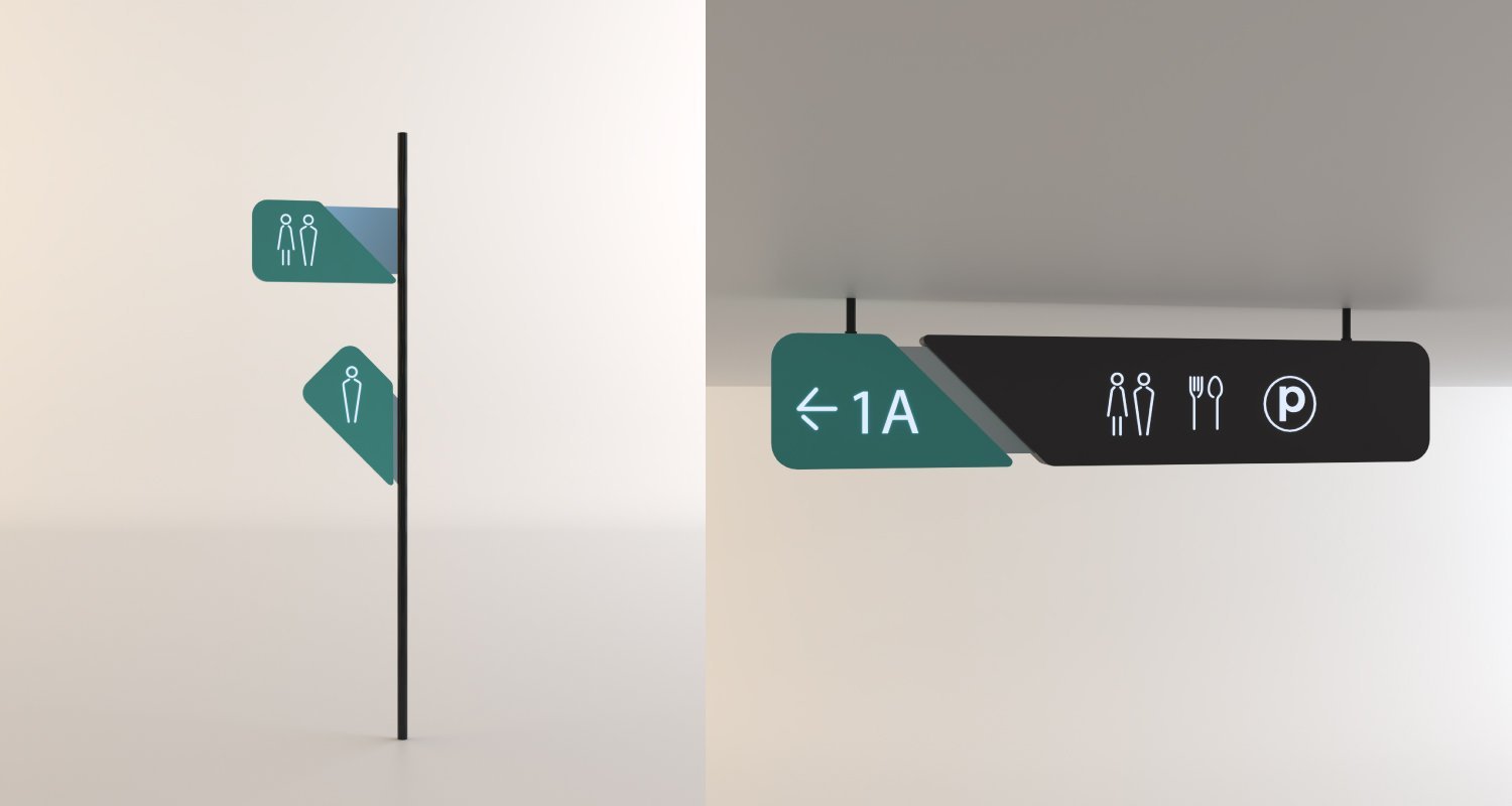
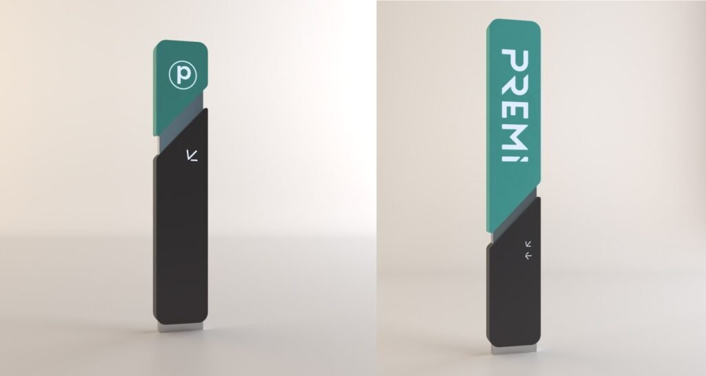
And a factory environment that carries the brand into the physical world. Staff uniforms for every role — factory workers, supervisors, support staff, male and female — each carrying the Premi® pin as the single required element. Employee and visitor badges. And a full signage system — outdoor pylons, indoor wayfinding, directional signage — calibrated to human eye levels: 1830mm for standing adults, 1350mm for wheelchair users, 800mm for children. Because a medical brand should be accessible to the people it serves.
One system, from the production line to the badge on the lapel.
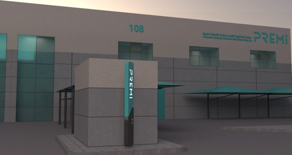
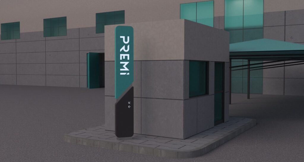
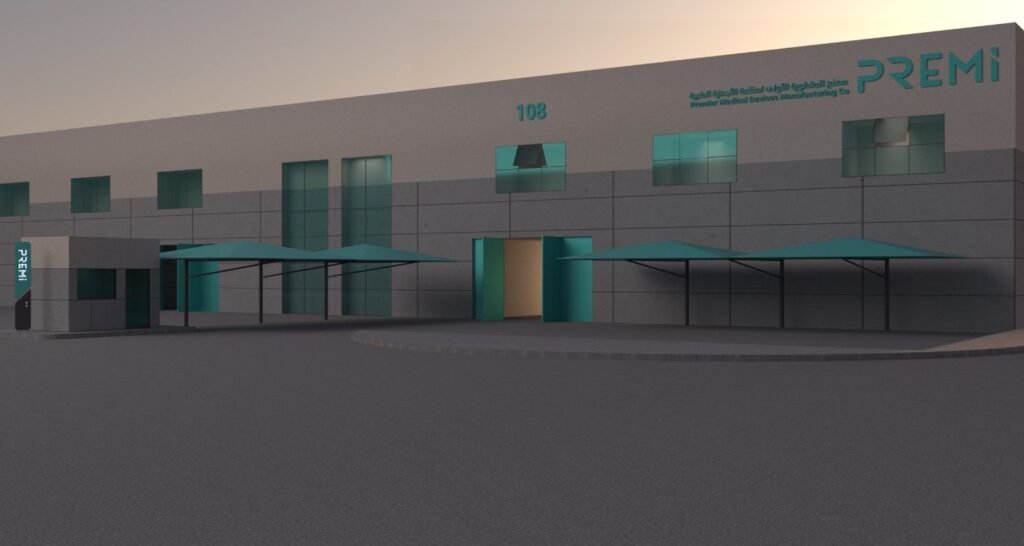
The Proof
Premi® now presents as one manufacturer — one visual language, one standard, one promise — across factory floors, corporate offices, and every touchpoint from business card to signage.
The brand system runs without BrainDing in the room. The mark travels across every application. The values inform every decision. The promise holds.
The result isn’t a manual. It’s a position.
Premi® — Forward-Looking Healthcare Solutions. Part of AlDawaa Medical Services Co. Ltd. (DMSCO), a publicly listed company.
See it live:
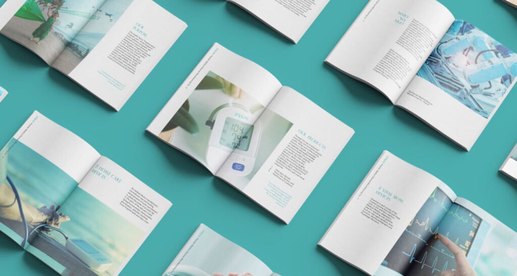
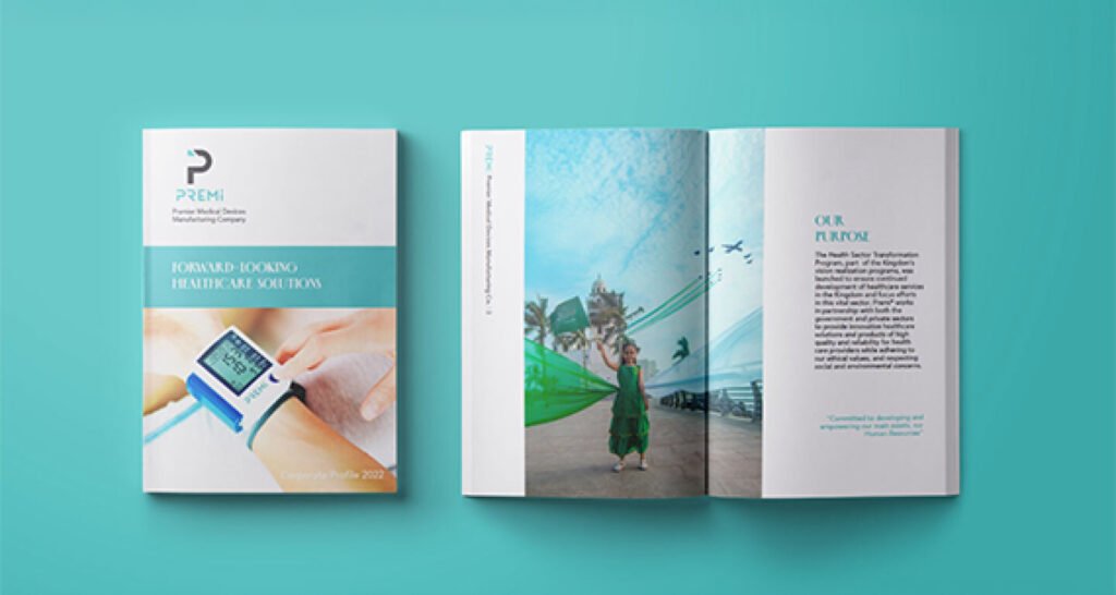
The brand system in the real world. Reliability made visible, from the production line to the patient’s bedside.