Outline Enterprises - Olé®
Say Olé!
For better living & working environments.
The Situation
OutLine Enterprise had been building furniture and fitting out interiors in Saudi Arabia for over four decades. The work was there. The reputation was there. What wasn’t there was a brand the market could say.
The company had a long formal name — أوتالين للمشاريع / OutLine Enterprise — that described what it was but not what it did. In a category where clients choose between local contractors and imported international brands, OutLine was quietly delivering the international flair of a global fit-out firm with the accessibility and trust of a Saudi manufacturer. But the identity on the letterhead and the van didn’t carry that confidence. It read like a supplier, not a partner.
The gap wasn’t craftsmanship. It was recognition.
Science
Brand Foundation
We started with a question the company had never been asked directly: what do people actually do when they experience your work?
They don’t sign off on a spec sheet. They step into a better room and feel it. That moment — the small, instinctive satisfaction of a space that works — had a word the brand could own. Olé — an exclamation of approval, of encouragement, of celebration. The short form of OutLine and a word everyone already knows how to say.
That insight became the operating doctrine. A brand essence built on the Olé flair — the combination of local Saudi craftsmanship and international furnishing design. A vision to be the first choice as the local manufacturer, supplier, and installer of fine furnishings across the GCC and the Middle East. A mission grounded in optimal use of space, quality craftsmanship, and professional project management. Six values that read like a fit-out brief: Customer Service Quality, Craftsmanship Excellence, Innovative Thinking, Commitment to Integrity, Teamwork Spirit, Leadership Orientation.
One idea — say Olé — expressed across every space the brand touches.
Senses
Design & Development
Then we built what clients would see before they saw the work.
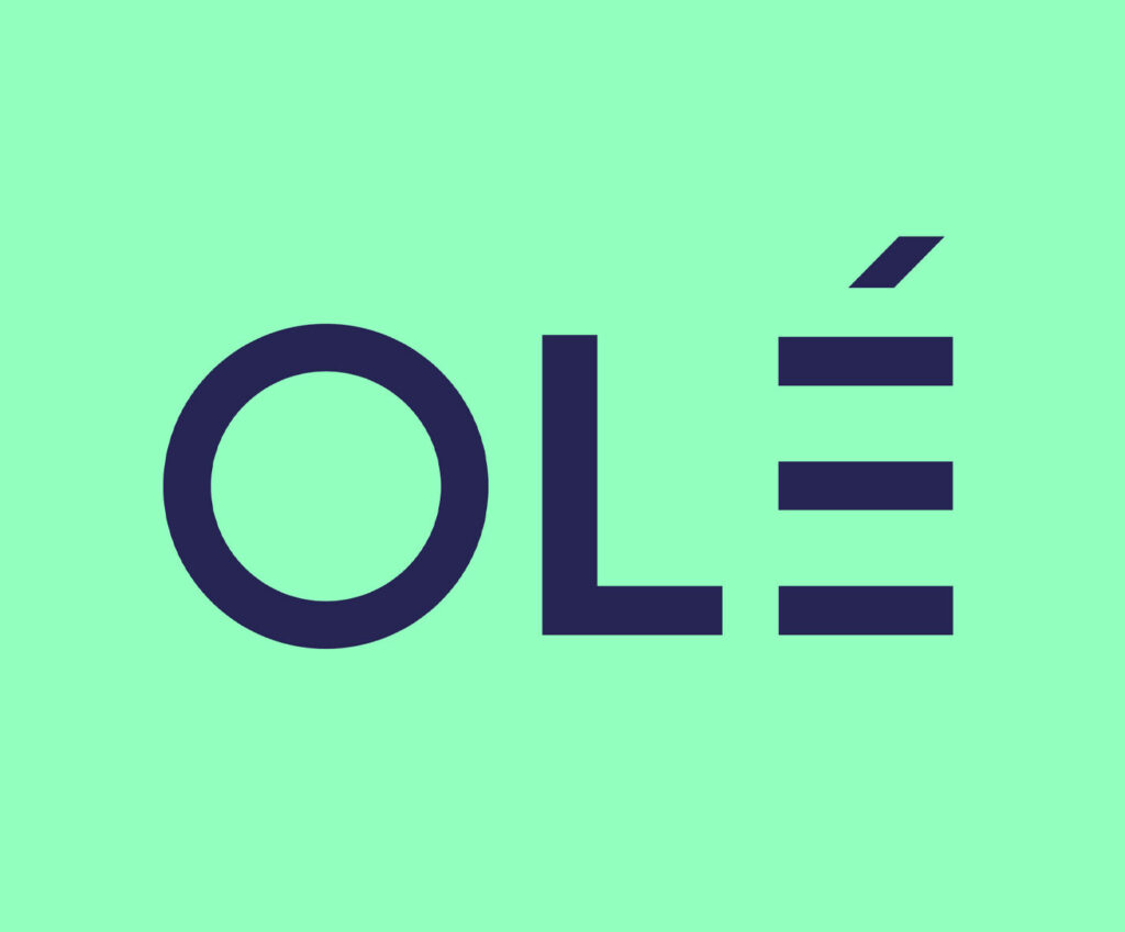
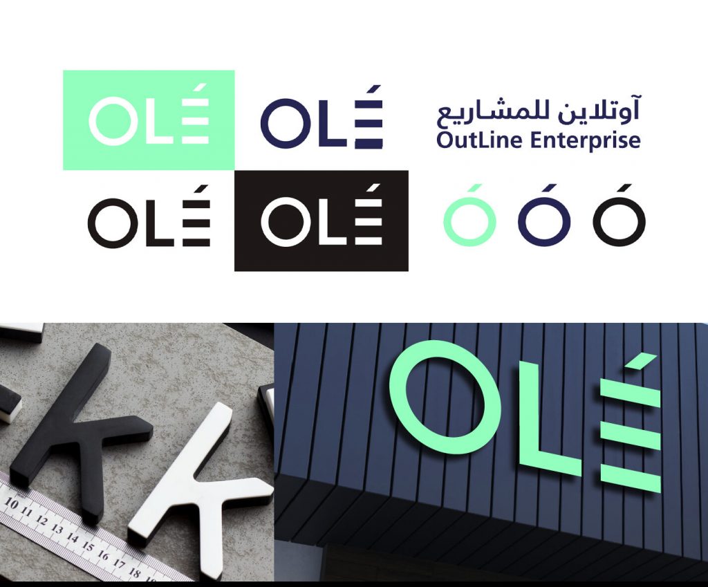
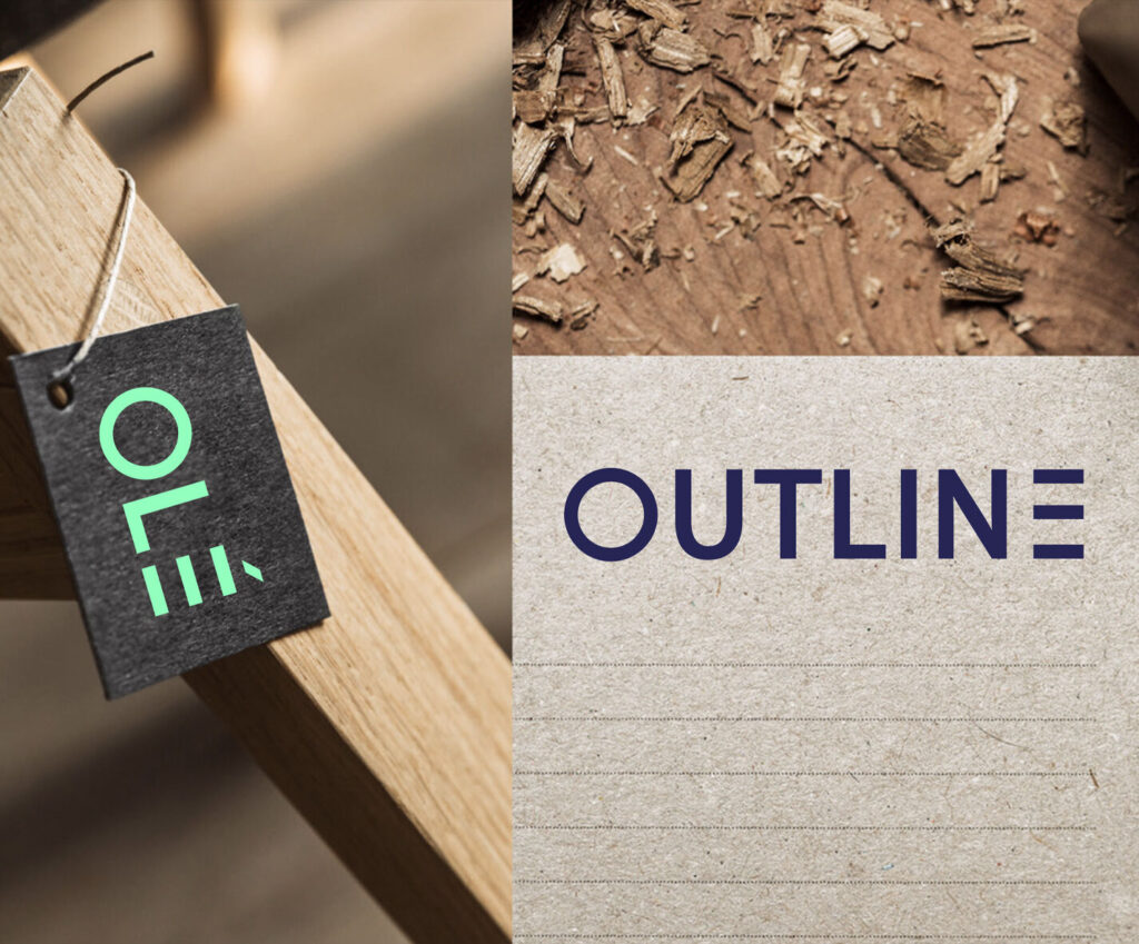
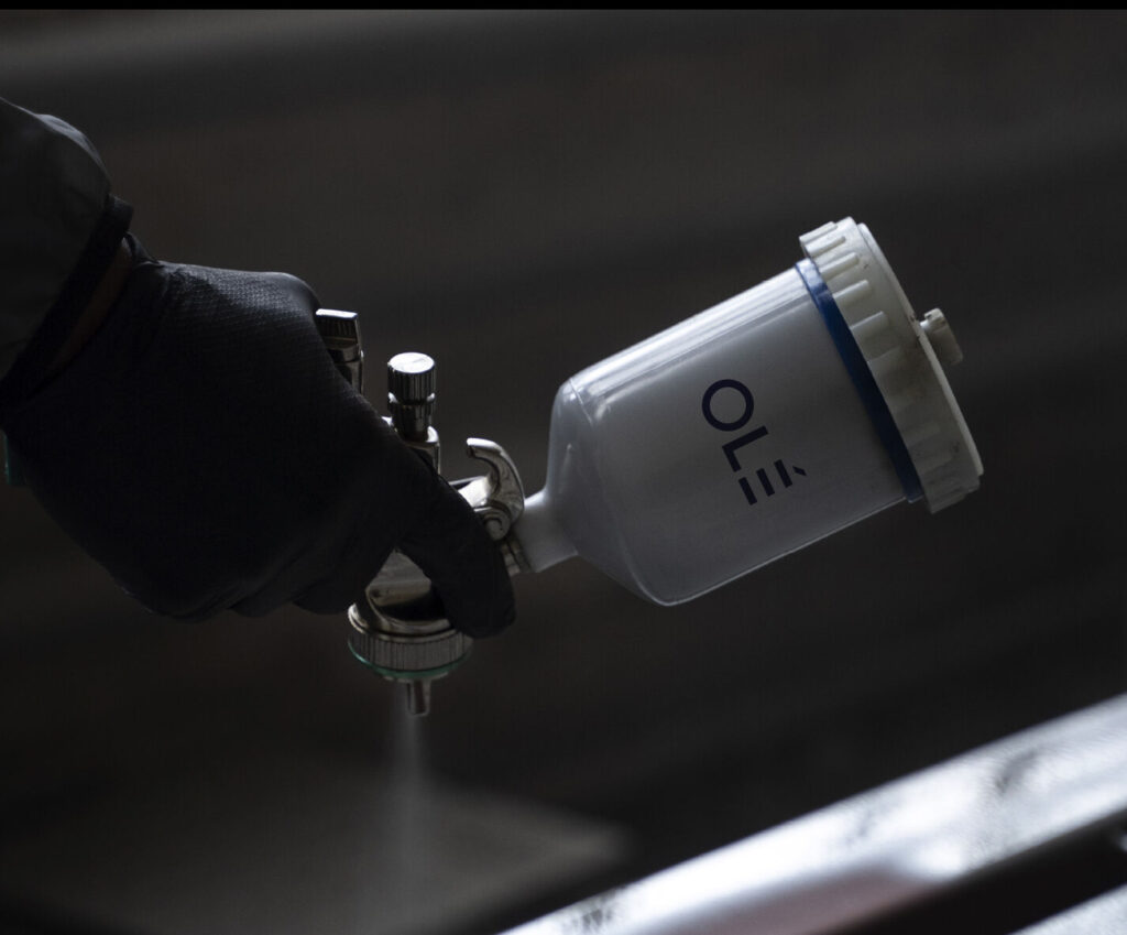
A logotype where the accent on the É becomes three horizontal bars — a quiet, ownable mark that reads as movement, precision, and finish. A bilingual structure where Arabic and English sit together without one dominating, built to flex between primary, secondary, and legal applications. A two-colour system that carries the whole brand: Olé Blue and Olé Green — deep, calm, and unmistakably Olé. Typography built on Frutiger LT Arabic across both languages.
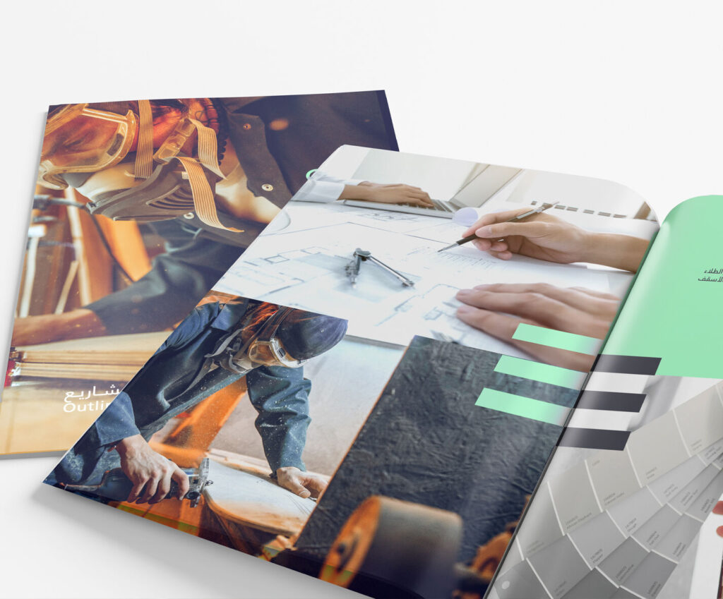
And the system extended to every place the brand is experienced: business cards, letterheads, envelopes, rollup banners, posters, showroom signage in acrylic and LED, fleet livery for vans and trucks, social templates, gifting that carries the Olé flair — a laptop stand, a knife block, wrapped and sealed with the mark — and an environment policy that treats the brand as something felt, not just printed. A hospitality dress code in dark blue, green, and black with the Olé pin. A gustatory house style of Saudi coffee, dates, tea, and cucumber water in glass. Even the brand’s scent — Vanilla and Lavender — chosen for how they shape behaviour in the spaces Olé builds.
One identity, from the workshop to the majlis.
The Proof
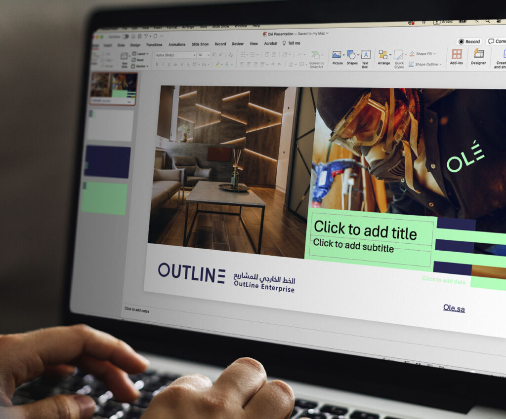
Olé now presents as one company with one name — short enough to say, distinctive enough to remember, and structured enough to scale across residential, commercial, and fit-out work. The bilingual mark travels from a hard hat to a showroom sign without losing recognition. The system runs in Arabic and English, in print and in space, without anyone having to explain it.
The result isn’t a rebrand. It’s a room people want to walk into.
The local Saudi manufacturer with international flair.
See it live:
The brand system in the real world. Better living made visible, from the factory floor to the finished space.