NHC | ALFURSAN SUBURB
A Suburb That Feels Like It Was Always Meant to Be There.
للمكانة مكان
The Situation
NHC was building a new kind of suburb — not a compound, not a development, but a place with a soul. The problem wasn’t the land or the masterplan. It was the feeling. How do you make a new place feel like it has always existed? How do you make it feel like it belongs to the culture it sits within?
AlFursan had a name and a location. What it lacked was a brand experience that could carry it from the masterplan to the memory. A brand that could speak to families, investors, and partners — all at once — without losing its voice.
The challenge wasn’t identity. It was experience.
Science
Brand Foundation
We started with a question, not an answer: what does it mean to belong to a place?
The answer became a sensory brand system — six dimensions of experience, from visual to olfactory to gustatory. Not a logo exercise. A full sensory architecture.
The NHC Branded House. One umbrella, one standard, one family of suburbs. AlFursan as a model development — a proof of concept for everything NHC could become.
A naming strategy rooted in Arabian heritage. AlFursan — The Knights. Eiyat AlFursan — The Knights’ Gift. Zones coded by geography: W1, W2, N5, E9. Streets named after native Riyadh plants. Gardens named after the horses of King Abdulaziz. Every name carrying a story.
Slogans drawn from poetry. “أعز مكان” from Al-Mutanabbi’s most famous verse — “The dearest place in the world is the saddle of a galloping horse… and the best companion in time is a book.” “للمكانة مكان” — a play on words that means both status and place.
A tone of voice entirely expressed through poetry. First-person. Culturally rooted. Future-facing.
One foundation. Six sensory dimensions. Never off-key.
To Senses
Design & Development
Then we built what the market would feel — across every sense.
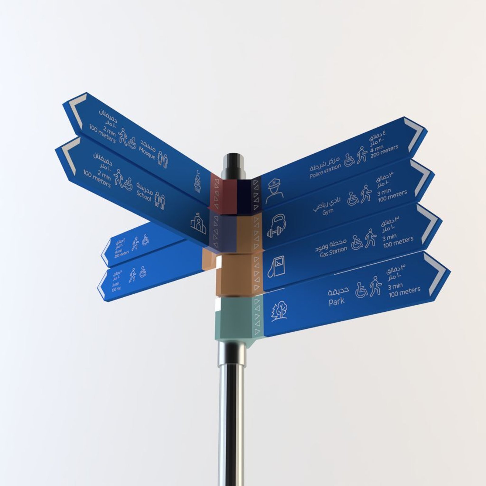
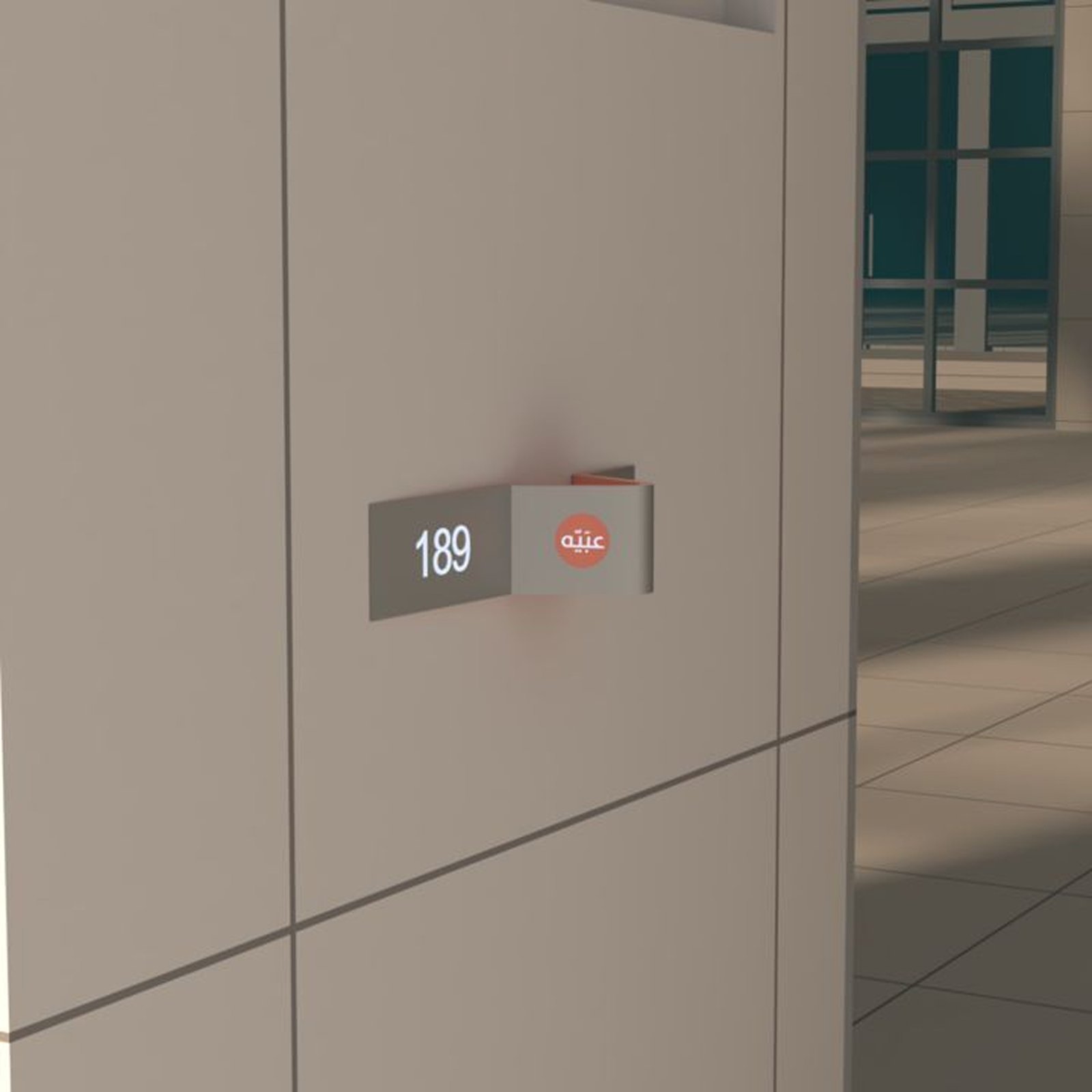
Visual. A logo built on the pillars of the NHC mark. A color system where Confidence Blue anchors 60% of every composition, Gold adds 20%, and secondary tones carry the rest. Kufyan Arabic Black for project names, NHC Bold for headlines, NHC Regular and Light for body. A grid system. Ornaments drawn from Najdi architecture — triangles, crenellations, the geometry of old Riyadh. Wayfinding icons built to human scale, with specified heights for accessibility.
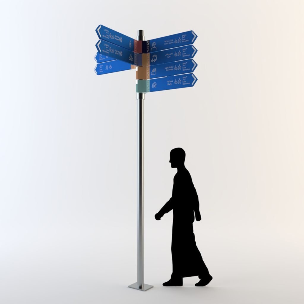
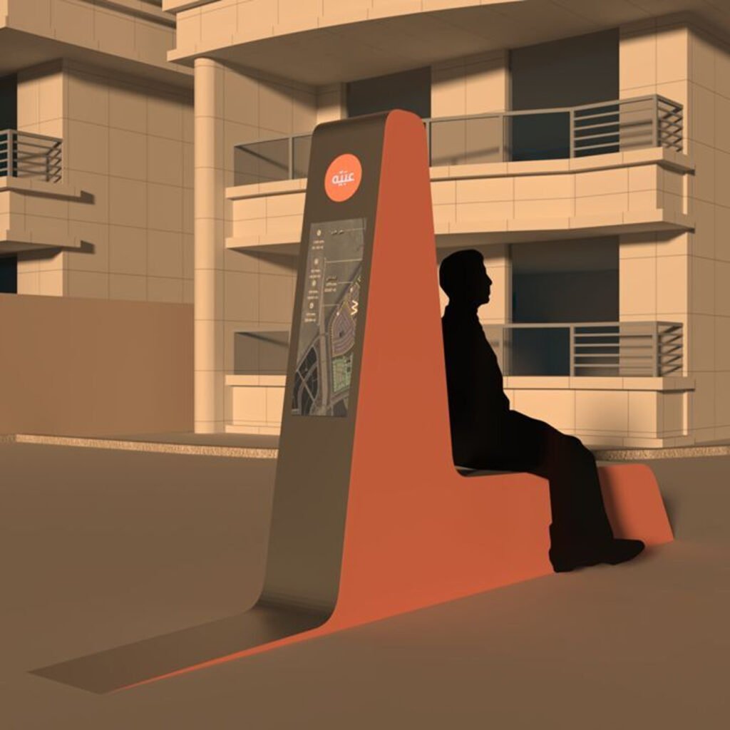
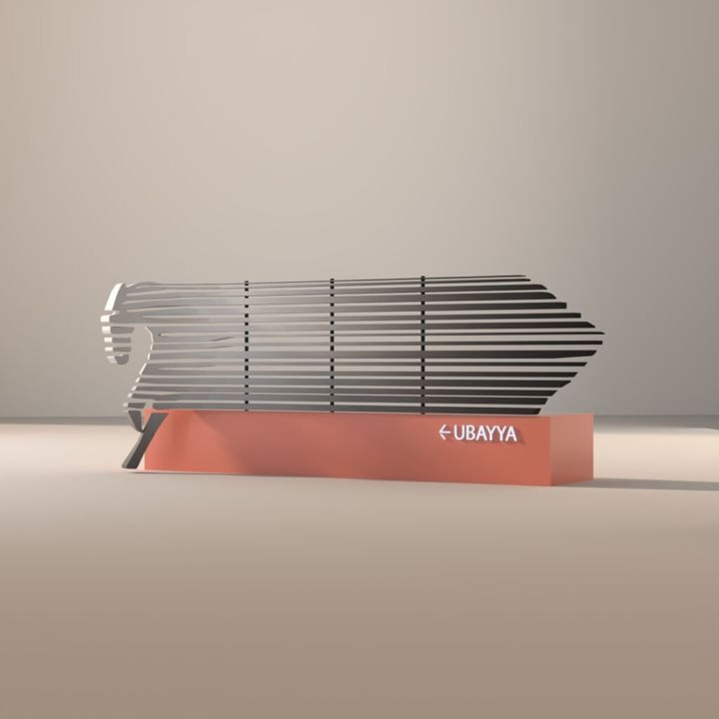
Tactile. A sculptural landmark at the entrance — the Arabian horse rendered in steel stripes, standing on Confidence Blue concrete. Wayfinding pylons in three heights. An exhibition system built from the pillars of the logo itself. Packaging that is recyclable, reusable, and beautiful. Even the pen carries the brand.
Auditory. A sonic identity woven from Arabic DNA — tradition, culture, and future combined. Motion graphics signatures that build to the full logo.
Olfactory. Ward Taifi and Lavender diffused through every sales office — a scent signature that makes the brand immediately recognizable.
Gustatory. A hospitality menu rooted in local generosity — Saudi coffee, dates, cucumber water — served in glass, never plastic. Because brand environment policy is brand experience policy.
Environmental. Refuse. Reduce. Reuse. Recycle. Rot. The brand has a conscience, and the manual says so.
One system, from the horse at the gate to the cup in your hand.
The Proof
AlFursan now presents as a complete brand experience — visual, tactile, auditory, olfactory, gustatory — all working together to make a new place feel like it has always been there.
The brand system runs without BrainDing in the room. The naming strategy is scalable across 16 projects. The sensory toolkit is documented, deployable, and self-sustaining.
The result isn’t a suburb. It’s a place.
للمكانة مكان — The Place to Live.
See it live:
The brand system in the real world. Strategy made visible, from the masterplan to the cup of Saudi coffee.