DARA SERVICED APARTMENTS
The Future Serviced Apartments, Designed With People.
The Situation
Dara was entering a market where serviced apartments were sold on square footage and nightly rates — not on how they made people feel. The Kingdom had no shortage of rooms. What it lacked was a concept built around the actual humans who would live there.
Every competitor was designing for a generic “guest.” Dara needed to design for five distinct ones — the family, the trendseeker, the calm thinker, the controller, and the business traveler — each with different needs, barriers, and definitions of comfort. And it needed to do it under one consistent brand, in two languages, across every physical touchpoint.
The challenge wasn’t a logo. It was a service philosophy made visible.
Science
Brand Foundation
We started with a question, not an answer: who actually stays here, and what does “home” mean to each of them?
The answer became five brand personas — living, breathing profiles of real guest types, their personal factors, their barriers, and the services that would win them. From those personas, the brand’s operating doctrine emerged: The Joyful Local Host.
A persona called Moazzeb — the informal, welcoming host who proactively supports guests, suggests where to go, and makes them feel at home. A positioning of “Innovative Serviced Apartments with a Joyful Local Touch.” Four values — Human, Innovation, Agility, Teamwork. A messaging system that speaks in first and second person, never third. “You & I.” “We.” “Consider it done.”
And nine service principles, from “Use empathy to serve uniquely on-point” to “The human touch comes always first, technology second.”
One foundation. Five guests. One host. Never off-key.
Senses
Design & Development
Then we built what the guest would feel — from the moment they see the building to the moment they check out.
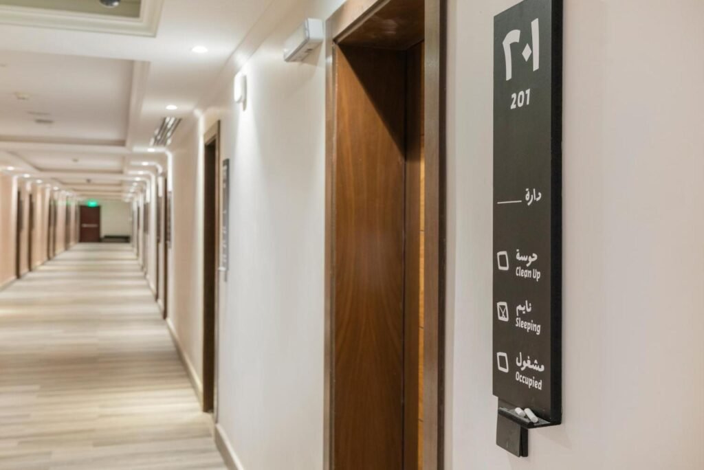
A bilingual logotype where Arabic and English mirror each other — two words, two scripts, one harmony. The dot on the “a” became the X factor that governs all spacing. The two dots above became continuity and progress — a graphic device that runs through pattern, iconography, and wayfinding.
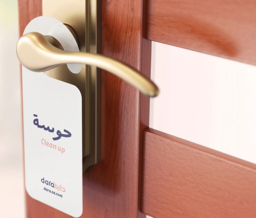
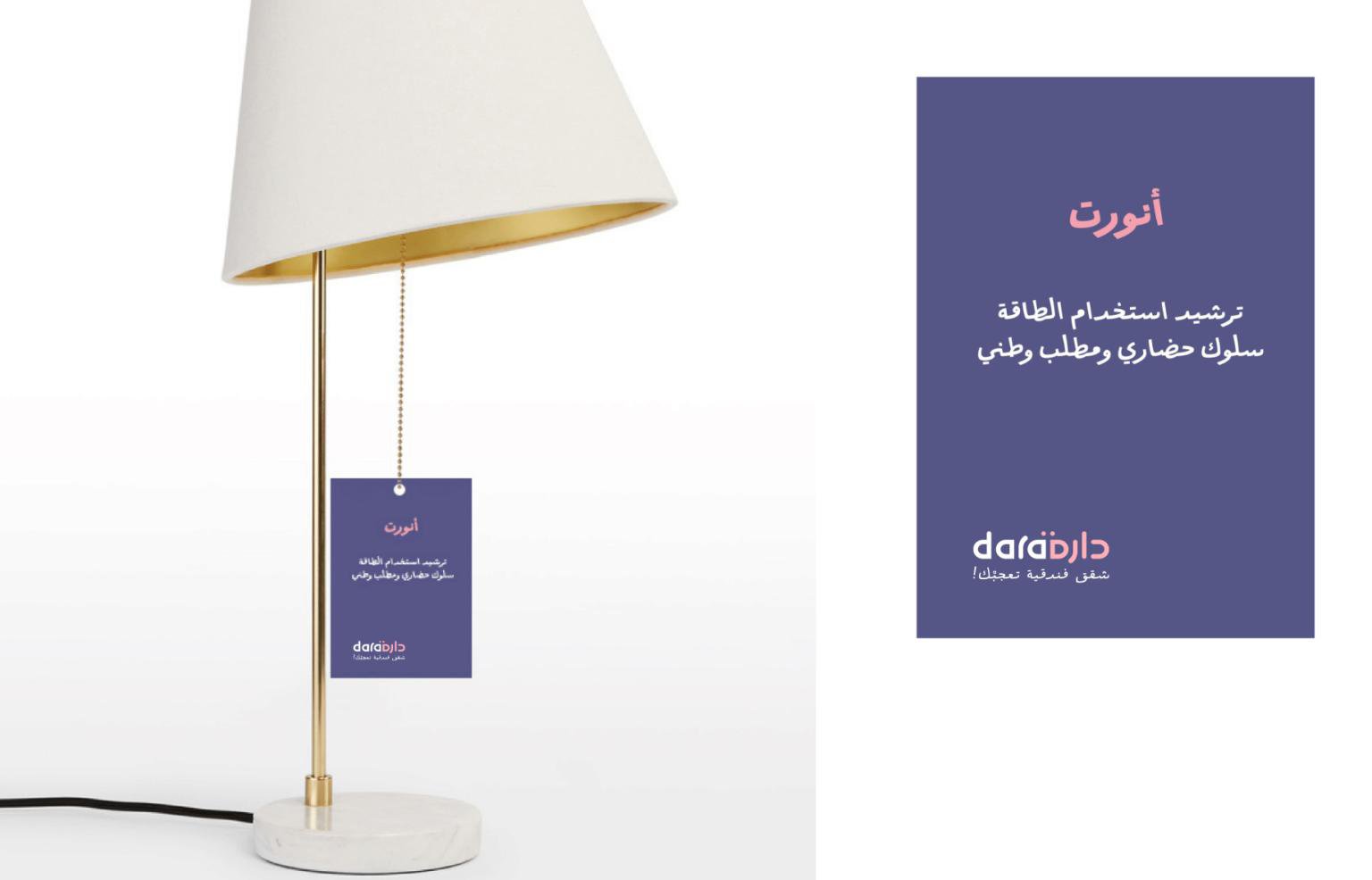
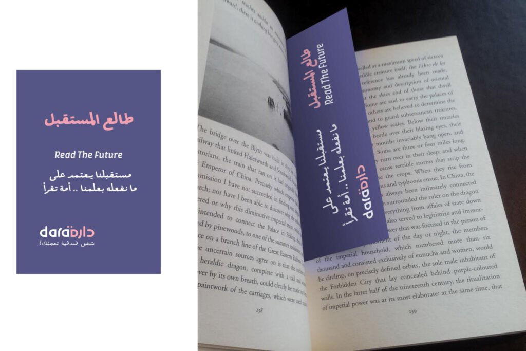
A color system of Violet and Peach as the primary notes, with secondary tones and highlight colors reserved for offers and important messages. Amman Sans Arabic across both languages — one typeface, two scripts, modern and unified. A grid system. Stationery. Name badges. Door hangers. Room door blackboards. Wi-Fi cards. Qibla direction markers. Energy-saving tags. Table tents. Bathroom signage. A full wayfinding icon set derived from the logo itself, with specified mounting heights for accessibility.
And a service language that lives on the walls — “الحياة سباق خيل .. وأنت الفارس” (Life is a horse race, and you are the rider). “لا نتوقف عن الطيران” (We don’t stop flying). “خير جليس” (The best companion). Inspirational messages in corridors, gyms, reading areas, and kitchens — because a serviced apartment is not just a room. It’s a place to live.
One system, from the building exterior to the bathroom towel tag.
The Proof
Dara now presents as one concept — five personas served by one consistent brand, one visual language, and one host philosophy. The identity runs across print, digital, environmental, and social without BrainDing in the room. The brand system is self-sustaining.
The result isn’t a manual. It’s a way of hosting.
Innovative Serviced Apartments with a Joyful Local Touch.
See it live:
The brand system in the real world. Strategy made visible, from the lobby to the last towel.