

BYLSAN
Where Ancient Ritual Meets Modern Care.
Myrrh, reborn.
The Situation
Bylsan entered a beauty and personal care market that is loud with promises — clinical claims, scientific jargon, and packaging designed to look like it belongs in a laboratory. Most brands in the category compete on what they contain: percentages, actives, and certifications.
Bylsan had something older and quieter. The name itself comes from myrrh — the ancient resin used for thousands of years across Arabia and the Levant for its healing, purifying, and restorative properties. It was a substance that ancient civilisations valued enough to inscribe on stone, trade across empires, and bury with their kings. That depth of heritage was real, but the brand hadn’t yet found a language to express it in a category that spoke in formulas.
The gap wasn’t the product. It was the story.
Science
Brand Foundation
We started with the name and its origin. What does myrrh actually mean to someone choosing a personal care product today?
It means care with lineage — a substance that has been trusted for thousands of years, not because it was marketed, but because it worked. That reading became the operating doctrine.
A brand essence built on ancient wisdom, modern ritual — the idea that self-care is not a new invention, but a practice that civilisations have been refining for millennia. A positioning that sits at the intersection of heritage ingredients and contemporary formulation — the same resin that was once poured into temples and tombs, refined for a modern body wash, a body cream, a soap concentrate. A visual language that uses the B as a calligraphic gesture — a letter drawn with the organic curves of herbs and the elegance of classical script, a mark that feels written rather than designed.
One idea — care that has always existed — expressed across every product, every package, every post.
Senses
Design & Development
Then we built what the market would feel before it read a single ingredient.
A logotype where the letter B is drawn as a single, fluid calligraphic stroke — derived from the curves of herbs and the first letter of Bylsan in both Arabic and English, with a small diamond anchor beneath that grounds the mark. The wordmark BYLSAN sits below in a classical serif, holding the composition with quiet authority. A colour palette that is deliberately soft and layered: Rose Gold, Purple, Turquoise, and Deep Plum, supported by peach and pale blues — a palette that signals warmth, care, and premium positioning without the clinical coldness of the category. Typography built on Ivy Mode across light, regular, and bold weights. Material finishes specified as Rose Gold Foil, Gold Foil, and Purple Foil for premium touchpoints.
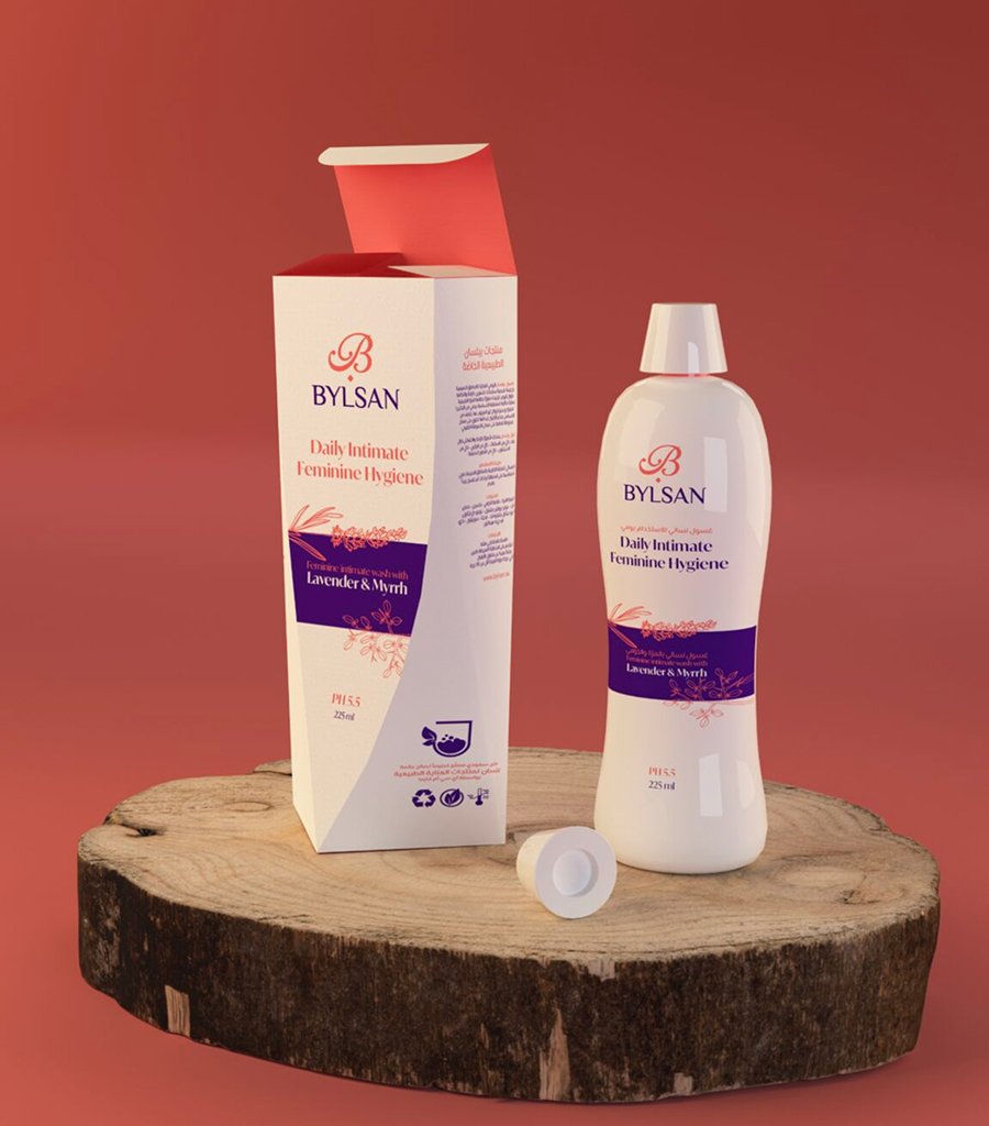
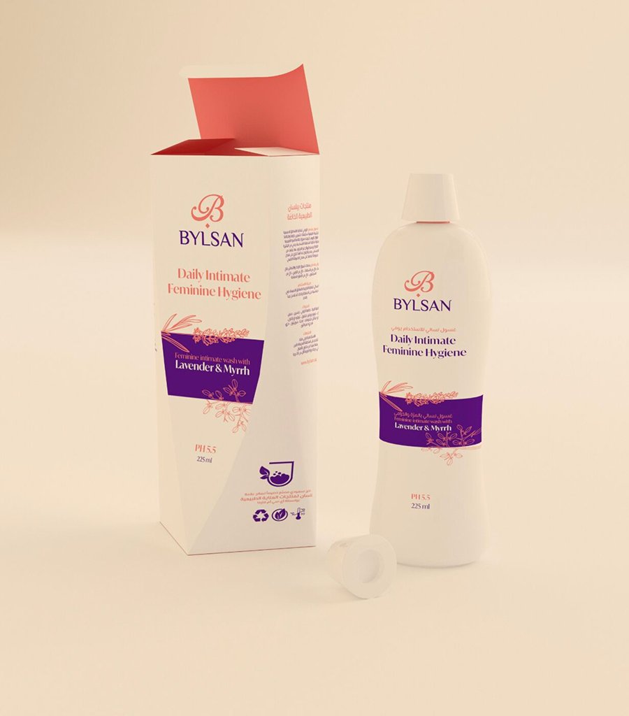
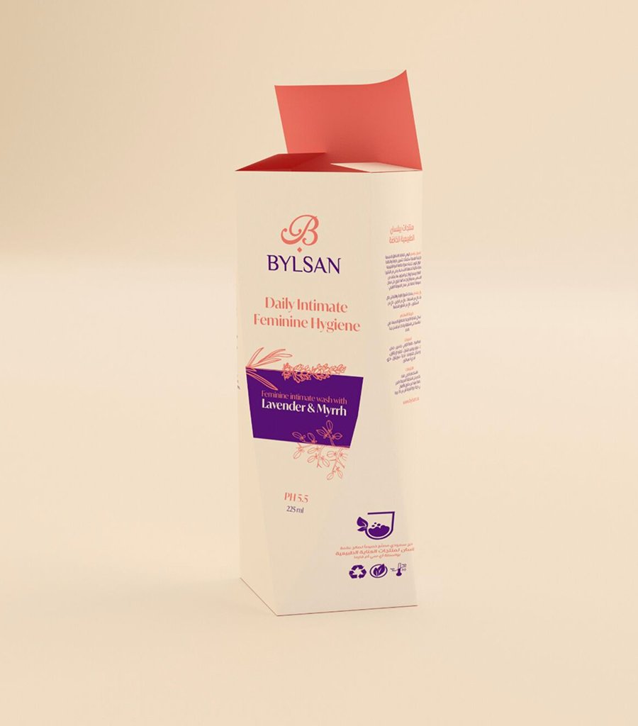
And the system extended to the full apparatus of a serious personal care brand: business cards in two options (purple and peach), A4 letterhead, DM and A4 envelopes, internal memo, fax sheet, tri-fold brochure, packaging grid system for boxes, tubes, and jars across the product range — including the Lavender Daily Vaginal Wash and the Body Cream for Lacerations. Social media templates built for Instagram, LinkedIn, Twitter, and Pinterest, each with defined profile and post dimensions. The brand system was built for a company that needed to feel both intimate and professional at once.
One identity, from the outer carton to the social feed.
The Proof
Bylsan now presents as one brand with one recognisable identity — a personal care line that carries a heritage ingredient, a name that means something, and a visual language that signals premium care without losing warmth. The calligraphic B, the foil finishes, and the layered pastel palette travel from a tube on a shelf to a Pinterest board without losing composure.
The brand system runs in Arabic and English, in print and digital, without anyone having to explain the concept. That was the point.
The result isn’t a product line. It’s a ritual.
The personal care brand built on myrrh — and on care that has always existed.
See it live:
The brand system in the real world. Ancient care made visible, from the outer carton to the daily ritual.