ALMASHAYEK PREMIUM COFFEE
يداوي الراس فنجاله
Heritage in every pour.
The Situation
AlMashayek entered a coffee market that was already crowded — global chains, specialty roasters, and a wave of Saudi and Jordanian brands all chasing the same young, brand-literate consumer. Most of them competed on the same three things: bean origin, roast profile, and café aesthetic.
AlMashayek had something none of them had. A story.
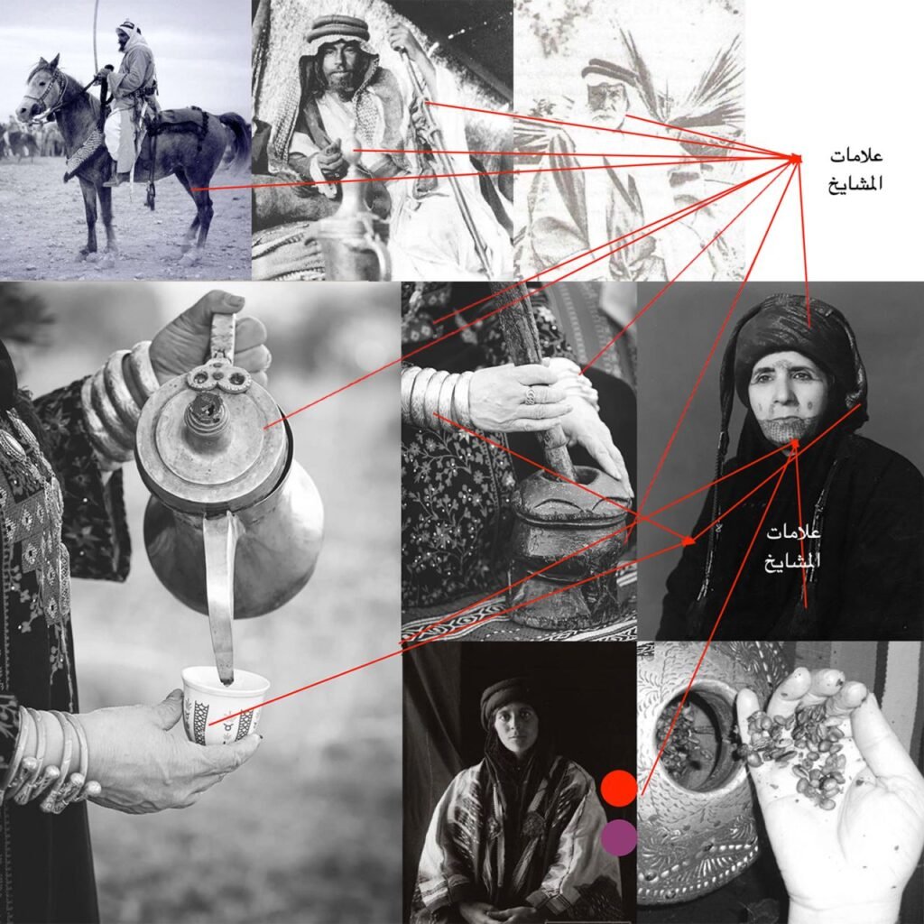
The brand is descended from a lineage of Bedouin coffee makers — AlMashayek, “the sheikhs” — who have been roasting and brewing in the old way since the beginning of the last century. The coffee was never just a beverage; it was an act of hospitality, a gesture of respect, a way of saying you are welcome here. That heritage was real and deeply felt, but the brand hadn’t yet translated it into a language the modern market could read.
The gap wasn’t authenticity. It was translation.
Science
Brand Foundation
We started with the name and the lineage. What does AlMashayek actually mean to someone who didn’t grow up with the story?
It means a host who knows how to honour a guest — the figure who pours first, offers the best, and does it without being asked. That reading became the operating doctrine.
A brand essence built on hospitality as craft — the idea that coffee is the medium, but generosity is the product. A positioning that sits at the intersection of authentic Bedouin heritage and modern premium quality — the same beans, the same methods, refined for a contemporary audience. A voice rooted in Bedouin white dialect, mixing the cadences of the Levantine and Arabian deserts — a language that sounds like a host speaking, not a brand marketing. A visual system that uses black and gold as master colours, with Jordanian flag red and green as secondary support — a palette that locates the brand geographically and emotionally.
One idea — the coffee that heals the head — expressed across every cup, every package, every post.
Senses
Design & Development
Then we built what the market would taste with its eyes.
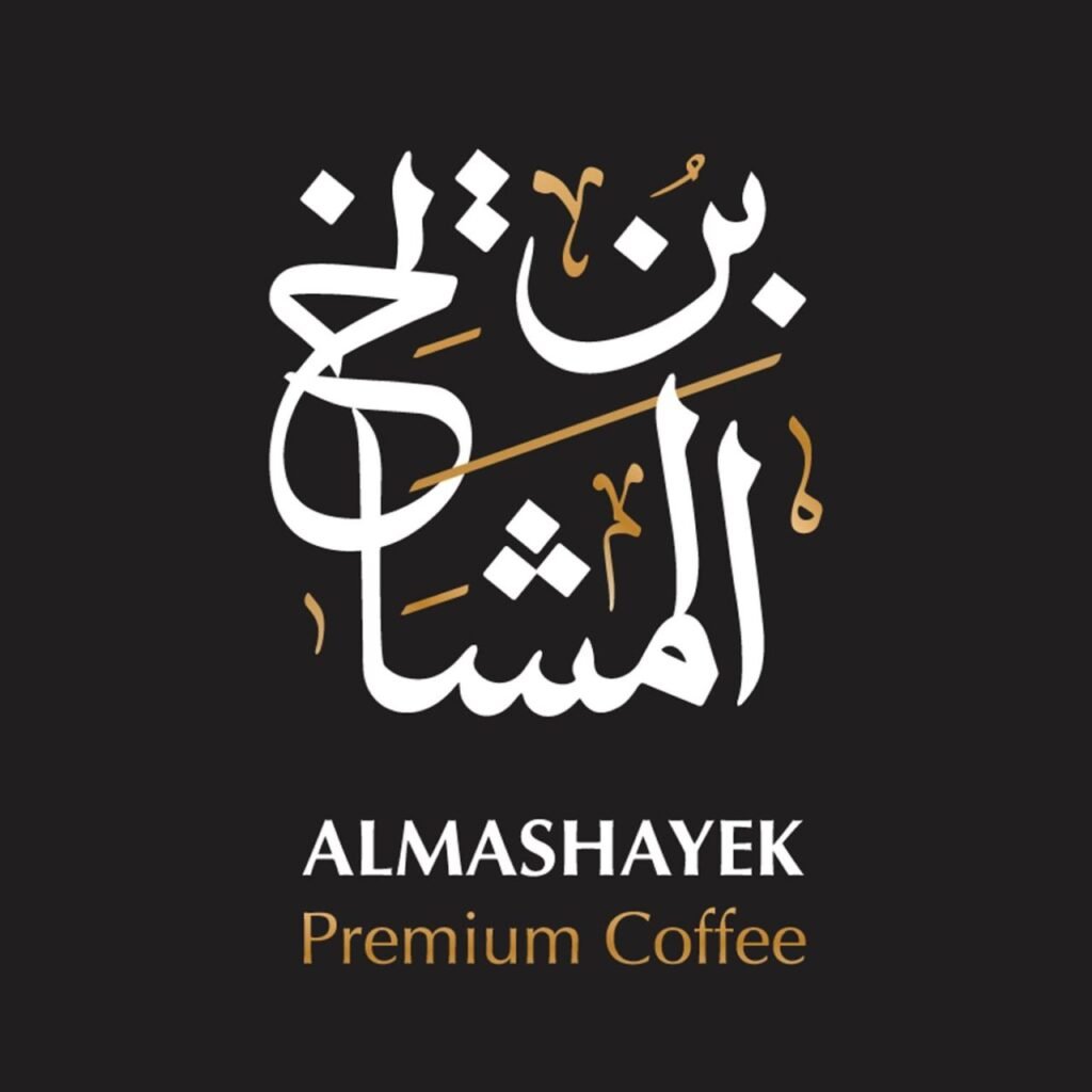
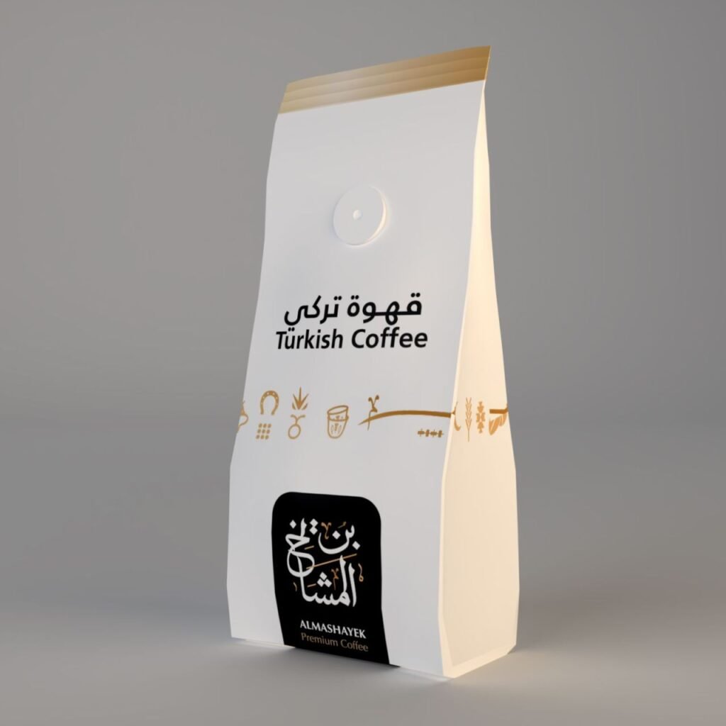
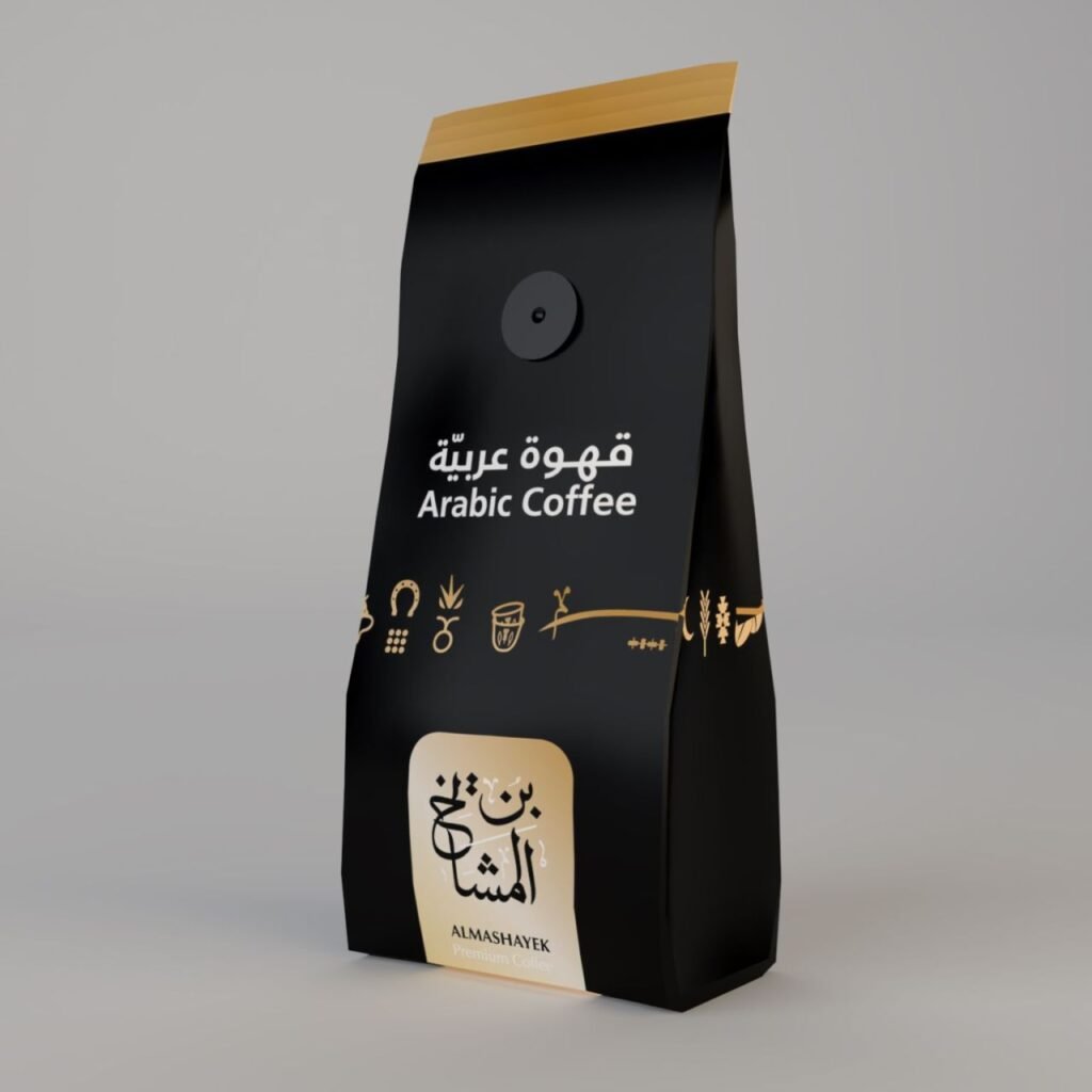
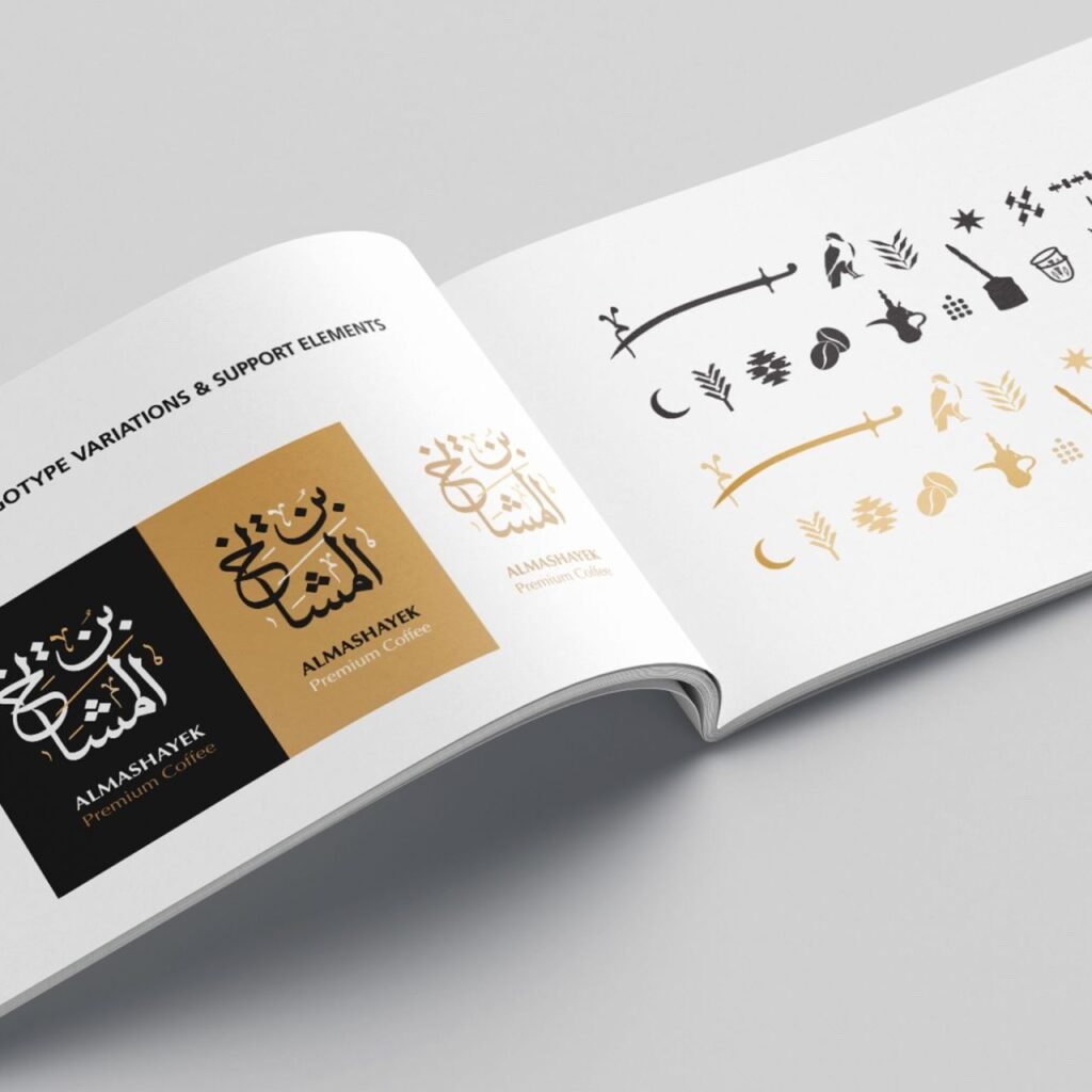
A logotype drawn as a bilingual Arabic calligraphic composition — the name set as a single, fluid gesture, with the Latin ALMASHAYEK / Premium Coffee anchored beneath in a composed, modern face. The Arabic carries the heritage; the Latin carries the clarity. A black-and-gold palette that signals premium without shouting. A secondary palette drawn directly from the Jordanian flag — red and green — used as accents, never as the lead.
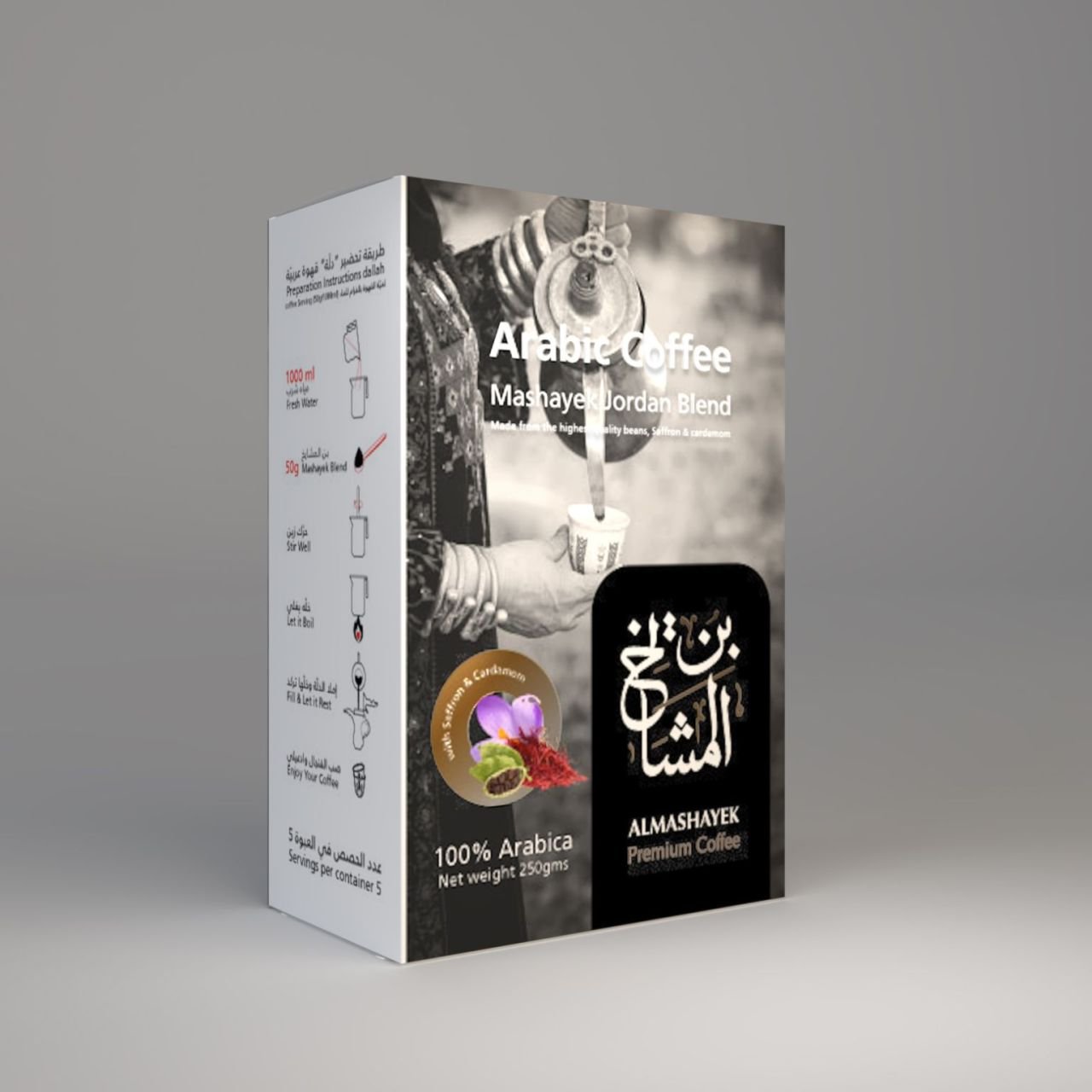
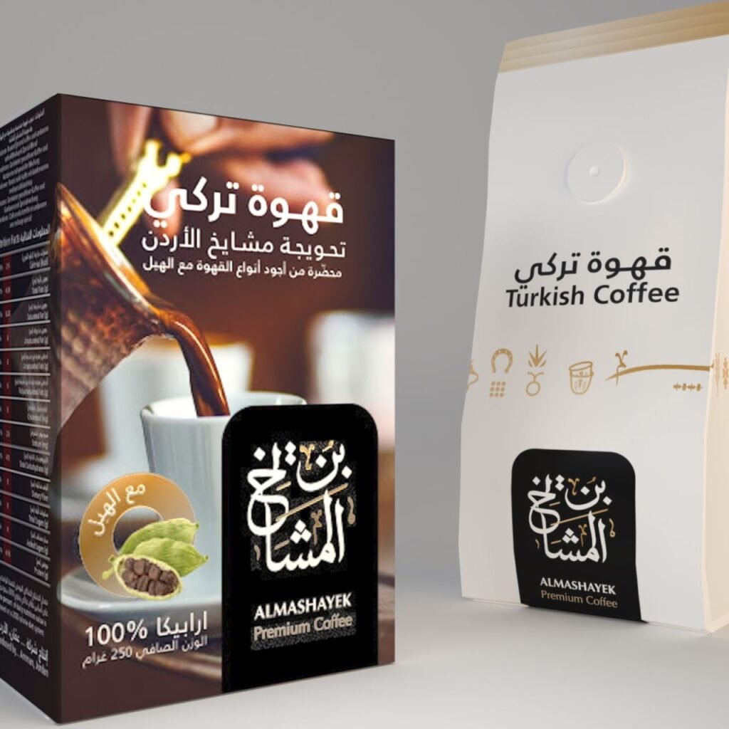
And the system extended to the full apparatus of a serious coffee brand: a complete packaging system for Arabic coffee and Turkish coffee in both 250g bag and 250g box formats, with clear preparation instructions, nutrition panels, product imagery, and a bottom gold band that runs across every pack. The packaging uses a photographic language built around the hand pouring the coffee — the gesture of hospitality made visible. Social media templates use the same visual grammar — the gold line, the icon set drawn from Bedouin coffee ritual (dallah, finjan, mortar, pestle, fire), and the calligraphic mark sitting on a dark panel.
One system, from the bag to the feed.
The Proof
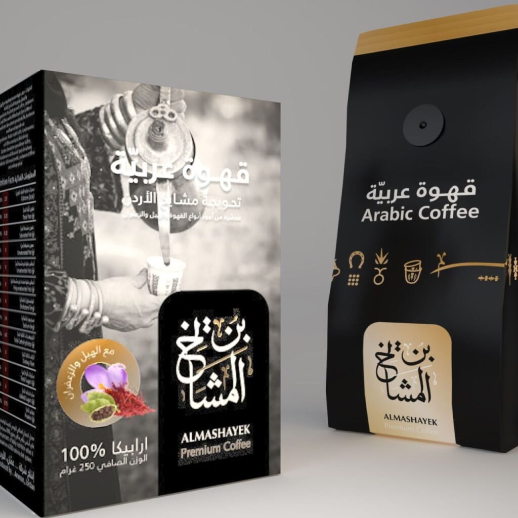
AlMashayek now presents as one brand with one recognisable identity — a coffee that carries a lineage, a name that means something, and a visual language that signals heritage and premium quality at the same time. The Arabic calligraphic mark, the black-and-gold palette, and the hospitality-driven photographic language travel from a retail shelf to a social feed without losing their voice.
The brand system runs in Arabic and English, in print and digital, without anyone having to explain the story. That was the point.
The result isn’t a coffee brand. It’s a welcome.
The Bedouin coffee that heals the head.
The brand system in the real world. Heritage made visible, from the bag to the cup.